2 Problems and Principles in Communicating Data
2.1 Introduction
Telling a story with data through a visual medium is an incredibly powerful tool we as data scientists have to quickly and effectively disseminate information to a broad audience. When done effectively, data visualizations can engender an appreciation of both the data itself, as well as the medium by which it is being delivered.
You can probably think of instances where you have observed a really good (or really bad) data visualization. For instance, check out the below visualization:
Or this one:
Or (because I love baseball) this one https://twitter.com/i/status/1107706014655229953
But you’ve likely also seen some not so effective visualizations as well. The source of the ineffectiveness could stem from a myriad of sources, but in general, if it takes a reader more than a few seconds to understand what information the visualization is attempting to convey, then it is likely an ineffective method.
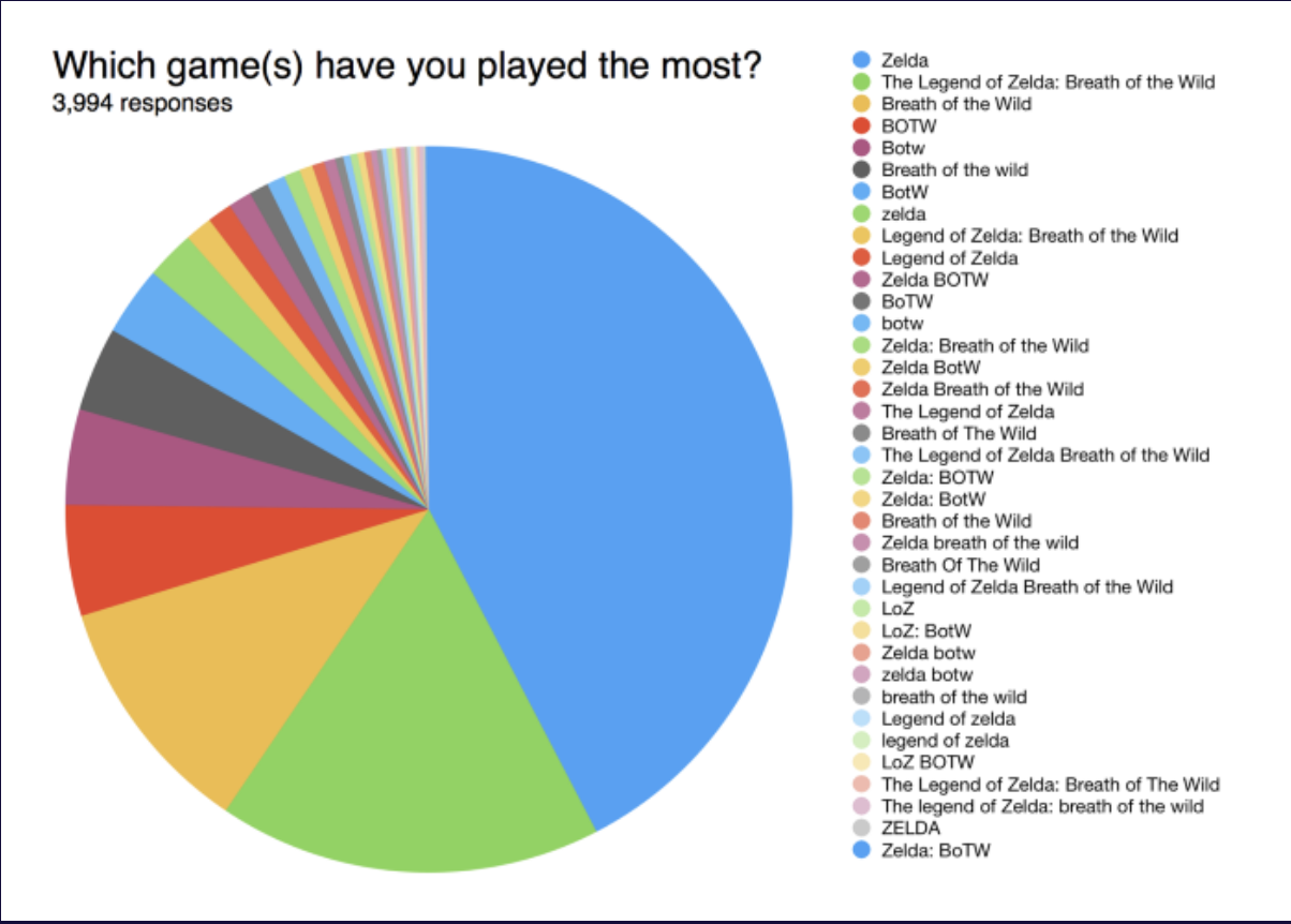
Pie charts are notorious for being ineffective:
As another example of a bad pie chart:
2.2 The Research Process
Data visualization is a piece of what I call the “research process.” The research process can be thought of as a somewhat more specific set of steps as part of the scientific method.
The process, in general, has the following steps:
- Overarching Question
- Data Collection
- Data Organization
- Data Analysis
- Data Communication
2.2.1 Formulating a Question
Before we start analyzing data using all of the cool techniques you have learned or will learn in your data science studies (as well as those you’ll learn in this course!), we need a question which guides the study.
For example:
- “Which products tend to be purchased at the same time?”
- “What is it about our coffee shop that brings customers back?”
- “Which universities produce the most Major League Baseball lefthanded pitchers?”
Answering the question, in effect, is the goal. In my opinion, the clear articulation of the research question is perhaps the most critical piece of the research process.
2.2.2 Gathering Data
Once we have our question clearly stated, we can then make a determination as to what specific data is necessary to answer said question.
This may involve querying databases and/or merging datasets from disparate sources. Or, alternatively, we may actually have to go collect the data from, say, human participants.
For instance, say my question is: “What is the relationship between time spent on TikTok and GPA among undergraduate students in Georgia?” I’m going to have to go collect information from these students since there is likely no other way for me to get it.
2.2.3 Organizing the Data
As I am confident you have learned, the structure of the data, once collected, is incredibly important for the data analysis phase, specifically for use in software, like R or Python. For most all analytical functions in R, the data need to be organized in a “tidy” or “long” format.
What this means is: every row is a unique observation and every column is a unique variable.
Using a subset of the famous mtcars dataset, the below table is organized in a tidy format as each vehicle has its own row and every column is a variable or characteristic of each vehicle:
| mpg | cyl | disp | hp | |
|---|---|---|---|---|
| Mazda RX4 | 21.0 | 6 | 160 | 110 |
| Mazda RX4 Wag | 21.0 | 6 | 160 | 110 |
| Datsun 710 | 22.8 | 4 | 108 | 93 |
| Hornet 4 Drive | 21.4 | 6 | 258 | 110 |
| Hornet Sportabout | 18.7 | 8 | 360 | 175 |
| Valiant | 18.1 | 6 | 225 | 105 |
2.2.4 Analyzing the Data
Once the collected data are in the appropriate format, we can then move into data analysis, of which data visualization is a major and important component!
It is here where we are using all of the analytical methods we have learned so far in order to answer the overarching question.
This could be something as simple as a t-test or something as complicated as support vector machines. The question guides us toward the methods and techniques available to us for appropriately answering the question.
2.2.5 Communicating the Results
Finally, once we have analyzed our data, the final step is effectively communicating the results.
To me, this is where exceptional data scientists can set themselves apart from other data scientists. It is expected that a data scientist can perform the analyses using whichever programming language. But, the best data scientists also know how to explain the results in an accessible way.
Data visualization almost certainly should be a component of data communication in all analyses.
2.3 A Model of Communication
In order for us to understand how to effectively communicate data using a visual medium, it may be useful to understand the communication process in general. As an example, suppose you are with a friend and you want to plan on going to dinner this coming weekend at a fancy new restaurant.
Here, the source of information (or data source) is the thought in your brain: “Hey I think it would be fun to go to dinner at this new fancy restaurant with my good friend this coming weekend.”
From there, you turn this thought into verbal words (the message) and communicate that with your friend with your voice (the transmitter).
What often gets overlooked in verbal communication is the role of non-verbal communication. Your tone, your hand gestures, your eyes, and your posture can all affect the meaning of the words being verbalized. All of this can be considered noise affecting the quality of the transmission.
The final message arrives to your friend (the “receiver”) who represents the final destination of the original message.
Clearly, they may interpret it in the way that was intended (“my friend wants to do something fun this weekend…I’m in!”) or in a way that it wasn’t intended (“my friend’s low-energy tone makes me think they are asking out of obligation or guilt and not because they really want to go with me”).
We can visually assess this process:
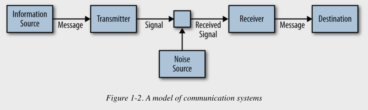
Using this simple model, we can see how the quality of the signal, which is a function of the method of transmission as will as the information or data source, directly affects the quality of the received message.
So for us, this suggests that we need to use the right tools for our specific data to deliver a quality signal to our end users.
2.4 Types of Communication Problems
I am confident that at some point in your life, you have run into a communication problem.
As an example from my own life, I was about 15 when AOL/MSN instant messenger became widely popular and high school sophomore Dr Brown was constantly running into communication issues with friends. This was one of the first times that text-based communication was widely used as a means of instant communication.
People, myself included, were not “texting” the way that they talk and that lead to all sorts of issues.
For us in data visualization, we can categorize communication problems into three broad types:
- The Technical Problem
- The Semantic Problem
- The Effectiveness Problem
2.4.1 The Technical Problem
The technical problem can be assessed with a question: “How accurately can the symbols of communication be transmitted?”
For us, this has to do with things like number of pixels, aspect ratio, sound quality, etc.
Really, it is anything which yields in an outcome in which the message’s receiver gets something other than what was originally designed/crafted.
This is sometimes an issue with using non-Instagram pictures in an Instagram post, without doing the appropriate resizing.
2.4.2 The Semantic Problem
The semantic problem can be assessed with the question: “How precisely do the transmitted symbols convey the desired meaning?”
In data visualization, this can take lots of different forms. As one example, maybe we use an inappropriate visualization for our data type.
In the donut pie chart example, those data would have likely been more effectively visualized as a bar graph with descriptive axis titles.
It could also look like using symbols not necessarily understood by all audience members.
For example, if we wanted to plot team-level data for National Basketball Association (NBA) teams using the team logo instead of name, but our audience is a general audience, they might not be clear one what information is being conveyed.
2.4.3 The Effectiveness Problem
The effectiveness problem can be assessed with the question: “How effectively does the received meaning affect conduct in the desired way?” or in other words: “So what?”
Ultimately, what we are attempting to do with visualizations is affect behavior in some form or fashion.
In the homeruns visualization, my “so what?” was the appreciation of how good of hitters the all-time greats were for such a long time.
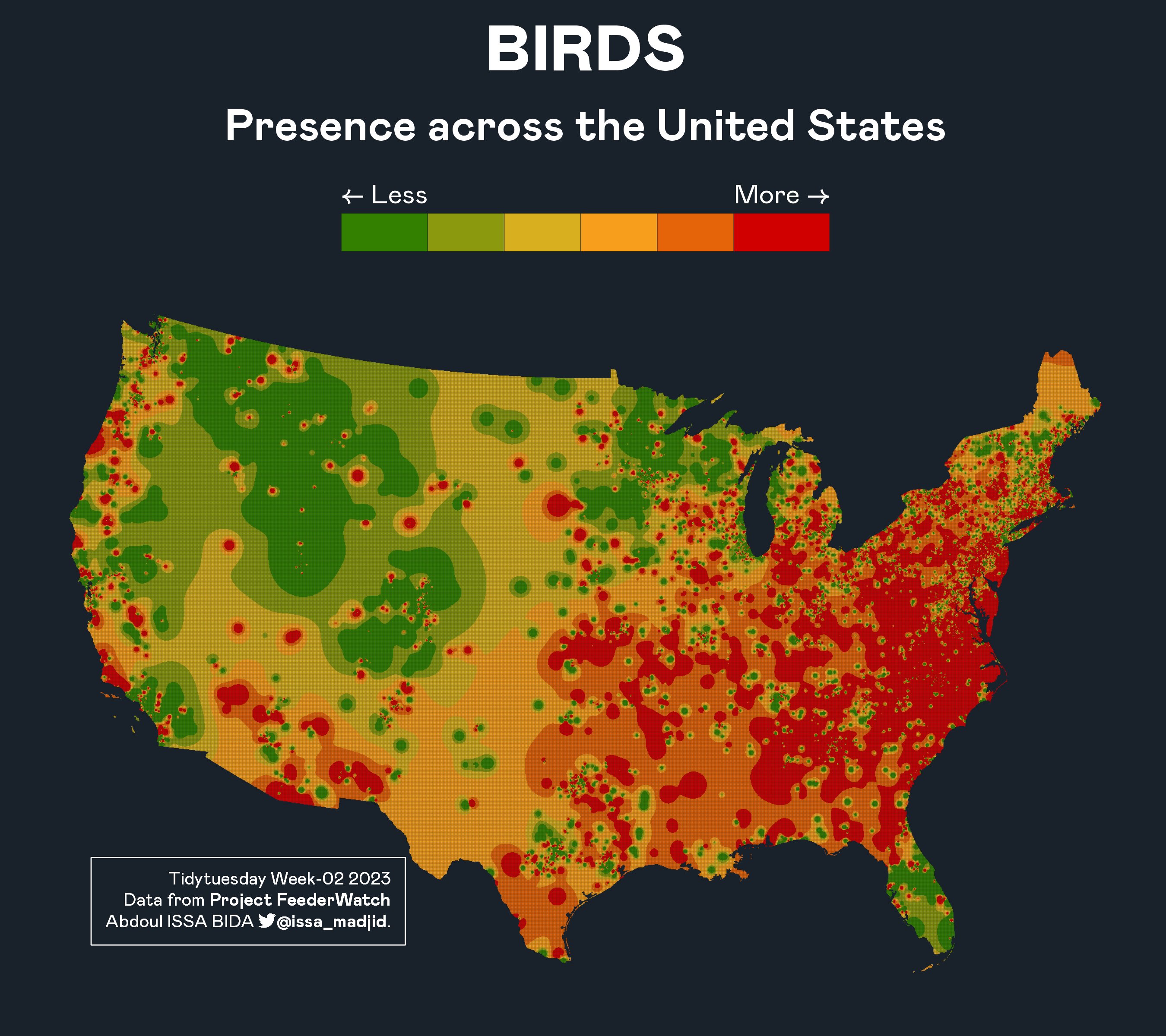
In the bird density visualization, my “so what?” was connecting the intuitive idea that birds are not highly concentrated in high-altitude locations, like the Rocky Mountain west.
2.5 Principles of Communicating Data
If we know that data visualization are useful and powerful tools for communicating information to broad audiences, and that we also know that there are problems we can encounter in doing so, it would be useful to have a general framework or principles for communicating data visually.
These principles are:
- Know your goal
- Use the right data
- Select suitable visualizations
- Design for aesthetics
- Choose an effective medium and channel
- Check the results
Let’s discuss these in more depth.
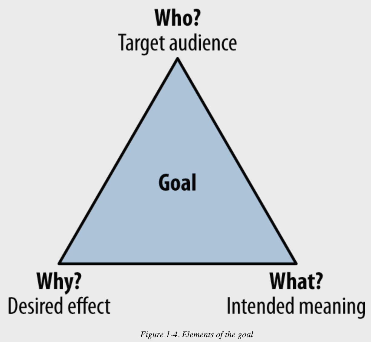
2.5.1 Know Your Goal
Clearly, understanding the goal of our visualization is important in deciding how to craft it. To understand the goal, we can ask ourselves a few questions:
- Who are you trying to communicate with? (specify the target audience)
- What do you want the audience to know? (specify the intended meaning)
- Why? What do you want them to do about it? (specify the desired effect)
If you can’t answer any one of these questions, you should not proceed until you can.
2.5.2 Use the Right Data
Clearly, in order for us to be able to achieve our goal, we need to ensure that we are using the “right” data. What is “right” is going to wildly vary depending on what the goal is.
I would say generally, determining what is right can be done by asking the two questions:
- Are the data related/relevant to the goal?
- Do I have the right amount of data for the intended message to be effectively conveyed?
For example, suppose I want to build a visualization which shows how undergraduate data science students are performing in an introductory computing class.
We would first need to operationalize “student performance.” One way could be by looking at the overall score for the course.
Next, we would need to decide how much data is right for our goal. Is one semester and one course sufficient? Or would we want multiple courses and multiple semesters? These questions should be answered before doing anything else!!
2.5.3 Select Suitable Visualizations
For us to effectively communicate information, we must use appropriate visualizations. In general, we do this by first understanding the variable types that we are graphing. In general, we have:
- Quantitative Variables (precise numeric values)
- Ordinal Variables (categorical variables with inherent ordering)
- Nominal Variables (categorical variables without inherent ordering)
What is effective for quantitative variables likely won’t be as effective for nominal variables and vice versa. We will talk more specifically about effective techniques for each variable type as the semester progresses.
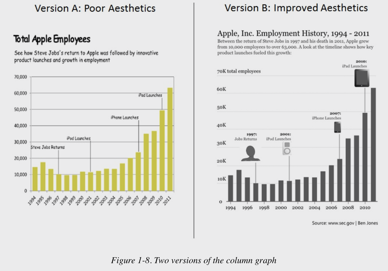
2.5.4 Design for Aesthetics
Visualizations can be designed with many or few aesthetic elements, such as watermarks or annotations or different font colors, etc.
These can be used to improve (or hinder) data visualizations. Let’s talk about a few different poor aesthetic choices:
- Poor Color Schemes
- Distracting Fonts
- Lots of Different Fonts
- Sloppy Alignment
- Poor use of Angled Labels
- Thick Borders/Grid Lines
- Unnecessary/Useless Images
- Using the Default Graphical Settings without Thought
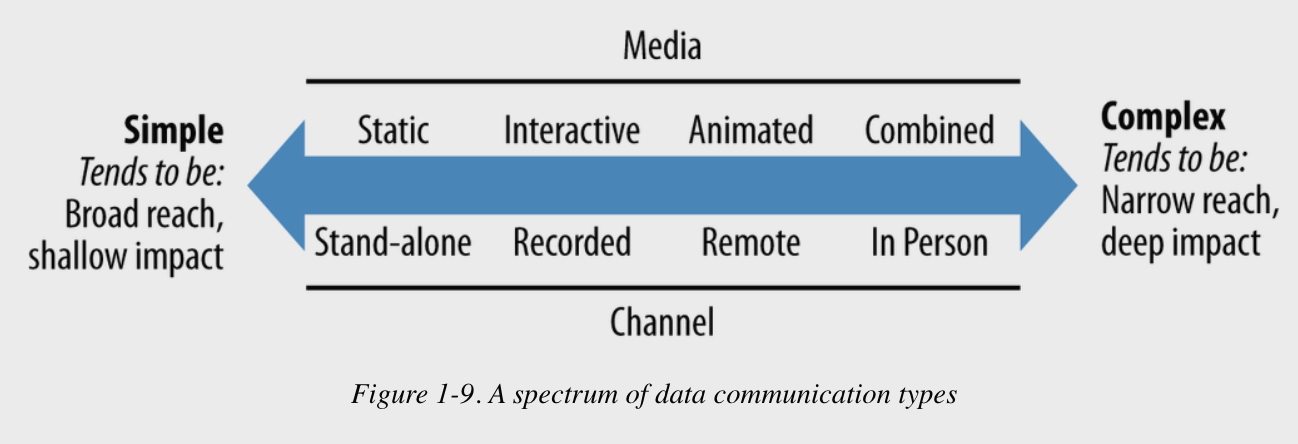
2.5.5 Choose an Effective Medium and Channel
When we discuss a “medium” what we are referring to is how the data visualization is to be communicated. Will it be:
- Standalone graphics or narrated?
- Static, interactive, animated, or combined?
- If narrated: recorded, live, or both?
- If live: remote, in person, or both?
- In all cases: broadcast, directed, or both?
These choices are going to affect the “channel” or audience.
2.5.6 Check the Results
Having feedback loops is a good life skill but is especially useful in data science and data visualization. This helps us know to what degree our efforts yielded the intended result.
To do this, we can ask questions like:
- Did the audience receive the message at all? Or who did and who didn’t?
- Did the audience interpret the data message in the way you intended?
- Did the audience react in the way you wanted them to react?
The answers to these questions can be useful in aiding the development of our visualization and data science skills.
2.6 Summary
In sum, while knowing how to create various types of visualizations is a wonderful skill, it is better to know how to create effective visualizations.
Throughout this course, we will explore specific ways of doing this very thing and also think critically about what effectiveness means in specific situations.
Next, let’s learn how we can use R, and specifically the ggplot2 package, to build quality visualizations to answer research questions…