In this section, we are going to be learning about existing methods which help us visually communicate, “How Much?”
“How much?” types of visualizations make use of quantitative variables, which are like:
“How much money did we earn this past quarter?”
“How much carbon dioxide is in the atmosphere?”
“How much time do undergraduate students in Georgia spend on social media sites per day?”
In other words, we will be focusing on questions which involve a single (or univariate) quantitative variable.
Quantitative variables could be characteristics like revenue, weight, distance, and time, among many, many others. Generally, here, our data source would need to be in aggregate form, so that a single record exists. For instance:
A sales order generating revenues of $95
A shipment weighing 5.2 pounds
A flight covering a distance of 2,408 miles
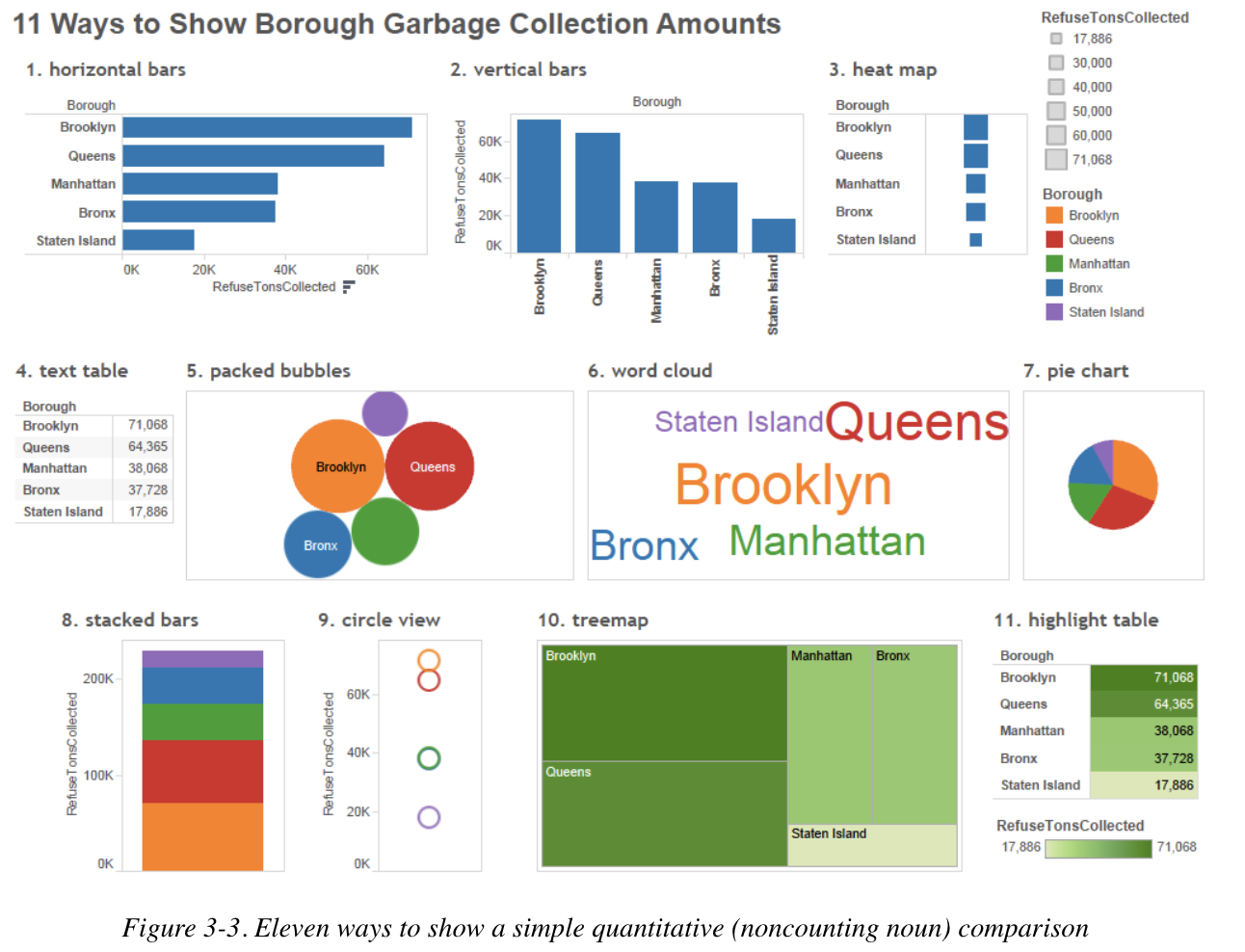
3.2 NYC Garbage Dataset Example
Let’s use NYC Garbage Data as an example. These data represent the amount of garbage (the less fancy term for “refuse”), in tons, collected each month of the year, in each of the boroughs and community districts in the city.
Suppose we wanted to know, “How does the amount of garbage/refuse (in tons) that the NYC Department of Sanitation reportedly collected from each borough compare during September 2011?”
Let’s see how we can accomplish this!
First, we have to subset the data to our specific time parameters (September 2011). Don’t worry about the warning message if you get one.
library(tidyverse)library(readxl)## To answer this question, let's first read in the data ##nyc <-read_xlsx("Communicating How Much/NYC Trash Data.xlsx")## Subset to September 2011 ##nyc_sept11 <- nyc |>filter(MONTH ==9& YEAR ==2011)## Sum up REFUSETONSCOLLECTED variable by Borough ##trash_tot <- nyc_sept11 |>group_by(BOROUGH) |>summarize(Sum_Trash =sum(REFUSETONSCOLLECTED))## Take a glimpse of the result ##print(trash_tot)
Our result here is the exact data we need to answer our above question! We have, by borough, the total amount of garbage produced, in tons, during September 2011. Now the question is: what tools and techniques do we have to turn this tabular data into a nice visualization? Well from the Communicating Data with Tableau text, we can see several examples of how to do this, all of which can be done with ggplot2!
For us, let’s start with the well-known bar chart!
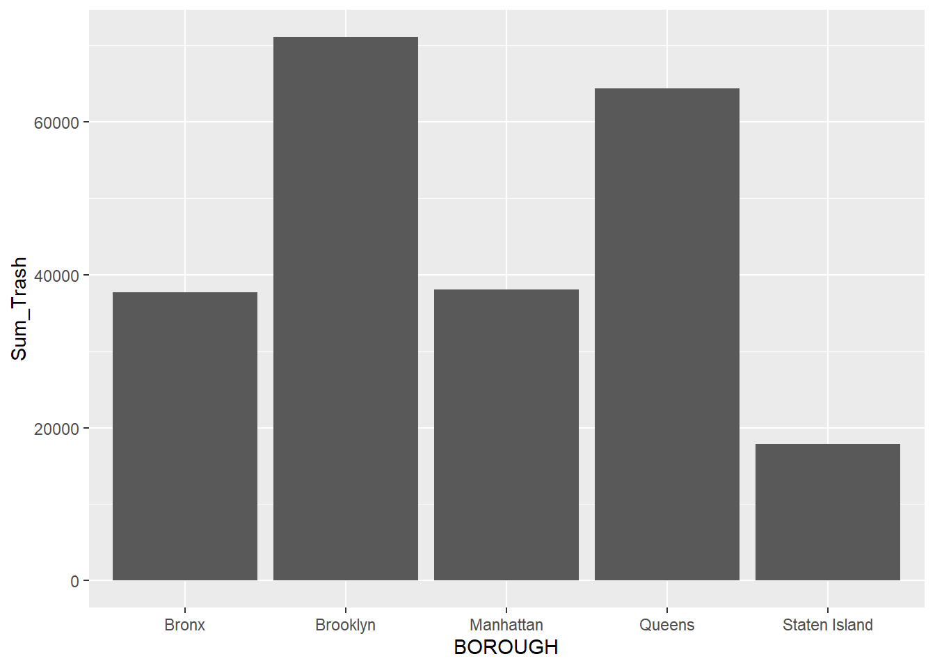
3.3 Building Bar Charts to Communicate “How Much”
To build a bar chart using ggplot2, we use the function geom_bar to help us out:
Great! We have a visualization to compare “how much?” But what are some problems that you observe? I notice a few right away:
Poor use/no use of axis titles and plot titles (How does anyone know what these data represent or what time period they represent?)
The comparison between boroughs isn’t as straightforward as it could be due to the bars being ordered in alphabetical rather than ascending or descending order.
The default color palette is less than desirable.
Let’s see how we can solve each of these problems by adding additional code to our base visualization:
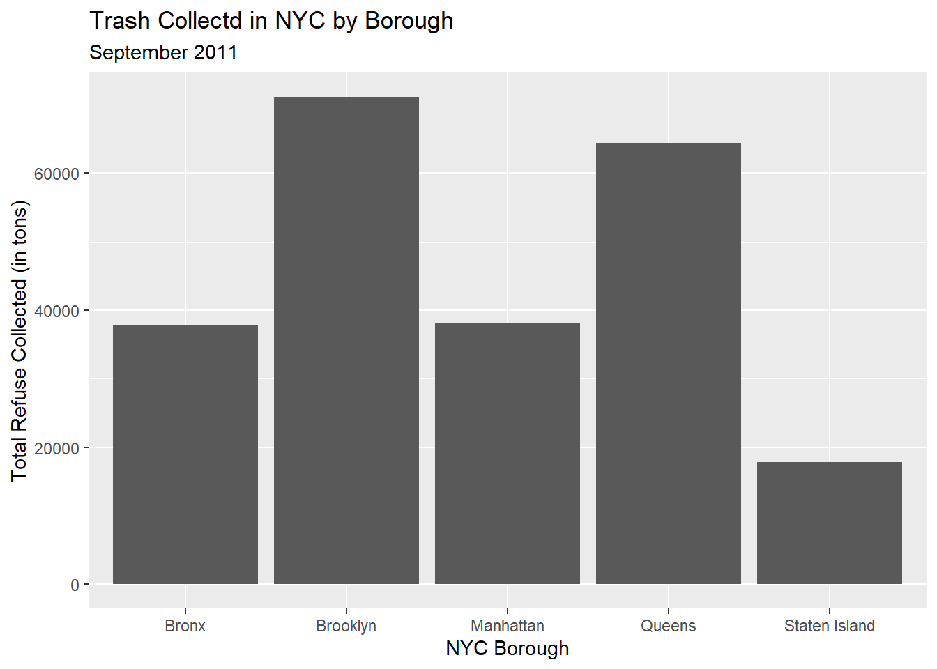
3.3.1 Including/Modifying Axis and Overall Titles
trash_tot |>ggplot(aes(x=BOROUGH,y=Sum_Trash)) +geom_bar(stat='identity') +labs(x ="NYC Borough",y ="Total Refuse Collected (in tons)",title ="Trash Collectd in NYC by Borough",subtitle ="September 2011")
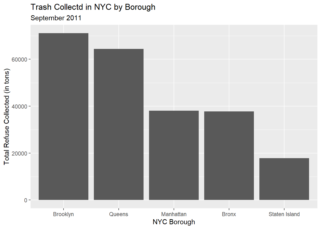
3.3.2 Reordering the Bars in Descending Order Based on Numeric Value
trash_tot |>ggplot(aes(x=reorder(BOROUGH,-Sum_Trash),y=Sum_Trash)) +geom_bar(stat='identity') +labs(x ="NYC Borough",y ="Total Refuse Collected (in tons)",title ="Trash Collectd in NYC by Borough",subtitle ="September 2011")
3.3.3 Changing the Color of the Bars and Overall Theme
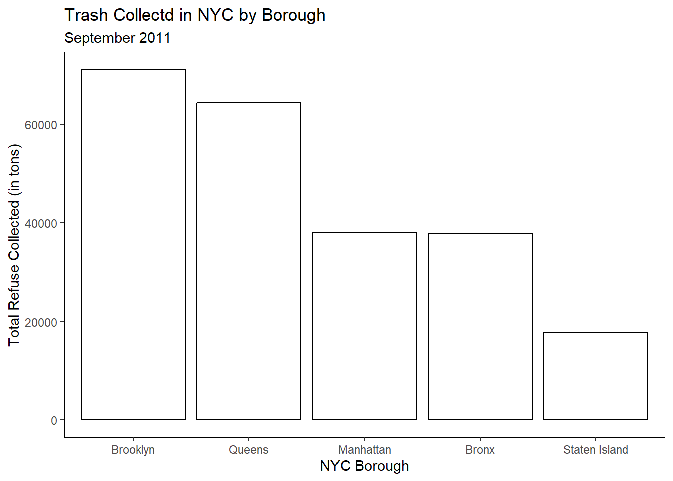
trash_tot |>ggplot(aes(x=reorder(BOROUGH,-Sum_Trash),y=Sum_Trash)) +geom_bar(stat='identity',color='black',fill='white') +labs(x ="NYC Borough",y ="Total Refuse Collected (in tons)",title ="Trash Collectd in NYC by Borough",subtitle ="September 2011") +theme_classic()
Notice how this final visualization is displaying the exact same information as our base visualization, but in a manner where audiences can more readily glean the information being conveyed (not to mention the improved aesthetics!).
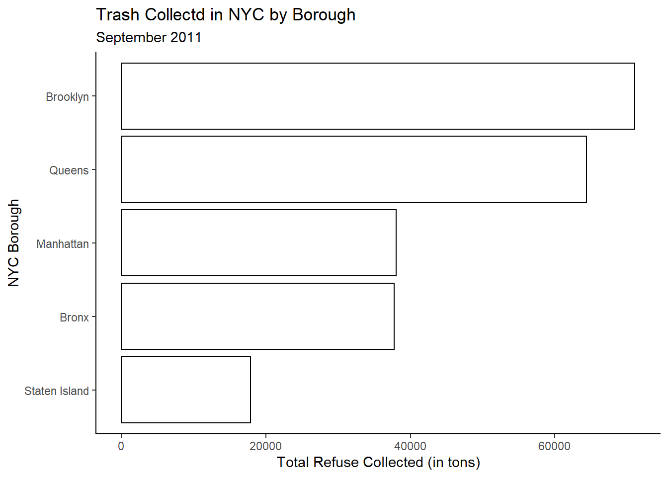
3.3.4 Ordered Horizontal Bar Chart
Note, it is also very common to display bar charts in a horizontal manner rather than vertical. To do this, we simply change our x and y arguments in the global ggplot function and remove the hyphen from the reorder function to still display the bars in descending order:
trash_tot |>ggplot(aes(x=Sum_Trash,y=reorder(BOROUGH,Sum_Trash))) +geom_bar(stat='identity',color='black',fill='white') +labs(y ="NYC Borough",x ="Total Refuse Collected (in tons)",title ="Trash Collectd in NYC by Borough",subtitle ="September 2011") +theme_classic()
3.4 Building Dot Charts to Communicate “How Much”
The ordered vertical and horizontal bar charts are really useful tools for comparing “how much” but certainly they aren’t the only tools.
Another tool, called the “dot chart” is sometimes preferred to the two methods previously discussed seeing as the eye may be overwhelmed by the bars. We are really just comparing values.
In essence, we only need the “top” of the bars, not the whole thing.
Using the basic ggplot2 syntax we have already developed for the bar charts, we can easily convert our bar charts into dot charts:
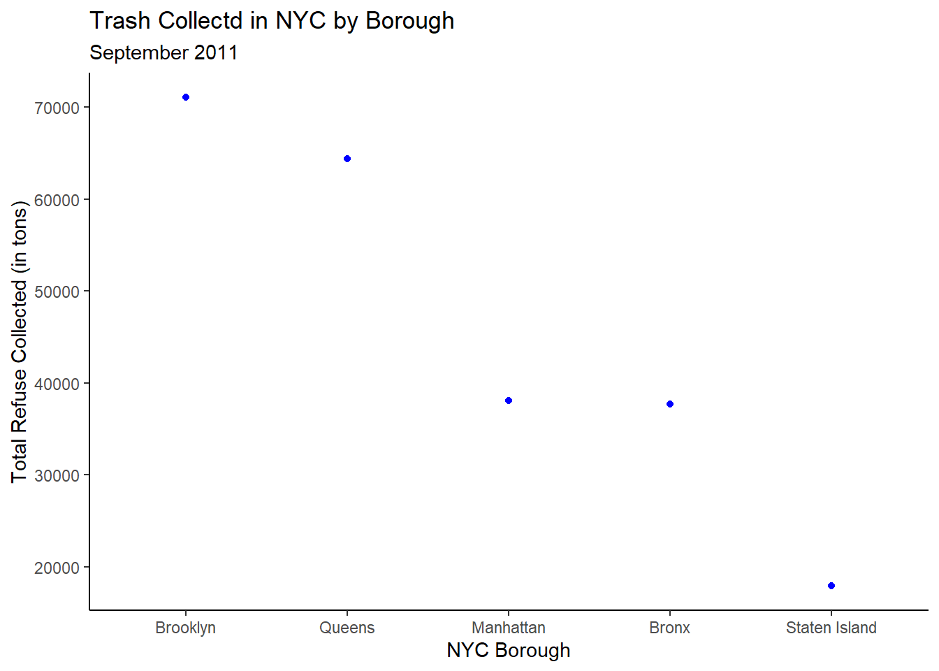
## Vertical Dot Chart ##trash_tot |>ggplot(aes(x=reorder(BOROUGH,-Sum_Trash),y=Sum_Trash)) +geom_point(color='blue',fill='blue') +labs(x ="NYC Borough",y ="Total Refuse Collected (in tons)",title ="Trash Collectd in NYC by Borough",subtitle ="September 2011") +theme_classic()
Notice something about these dots…they’re tiny! How can we control the size of the dots? We can use the size argument within the geom_point function. The default value is 1.5. We can increase or decrease this value based on our needs! Let’s try size=3:
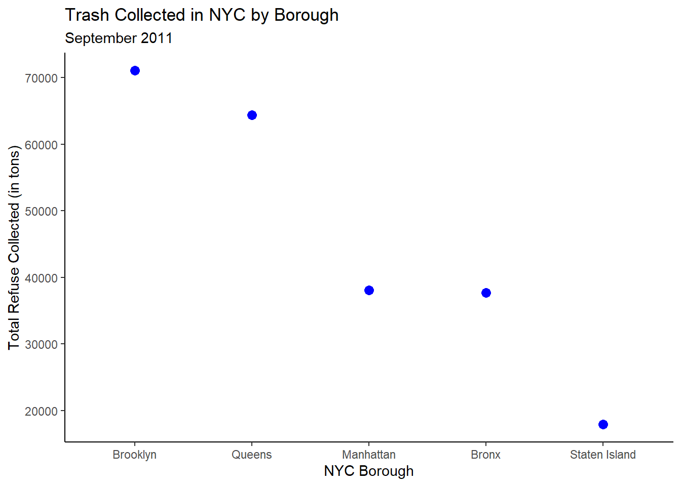
3.4.1 Controlling Point Size
trash_tot |>ggplot(aes(x=reorder(BOROUGH,-Sum_Trash),y=Sum_Trash)) +geom_point(color='blue',fill='blue',size=3) +labs(x="NYC Borough",y="Total Refuse Collected (in tons)",title="Trash Collected in NYC by Borough",subtitle="September 2011") +theme_classic()
This is better! And just like with the bar chart, we can convert our vertical dot chart into a horizontal dot chart with a small modification to the ggplot function’s code in the exact same manner as before:
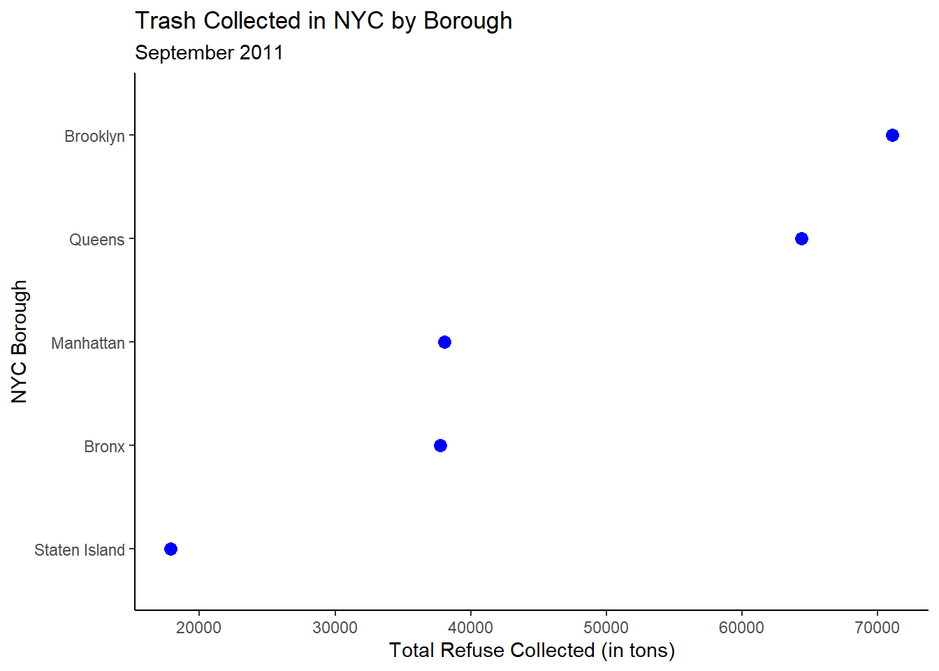
3.4.2 Ordered Horizontal Dot Chart
trash_tot |>ggplot(aes(x=Sum_Trash,y=reorder(BOROUGH,Sum_Trash))) +geom_point(color='blue',fill='blue',size=3) +labs(y="NYC Borough",x="Total Refuse Collected (in tons)",title="Trash Collected in NYC by Borough",subtitle="September 2011") +theme_classic()
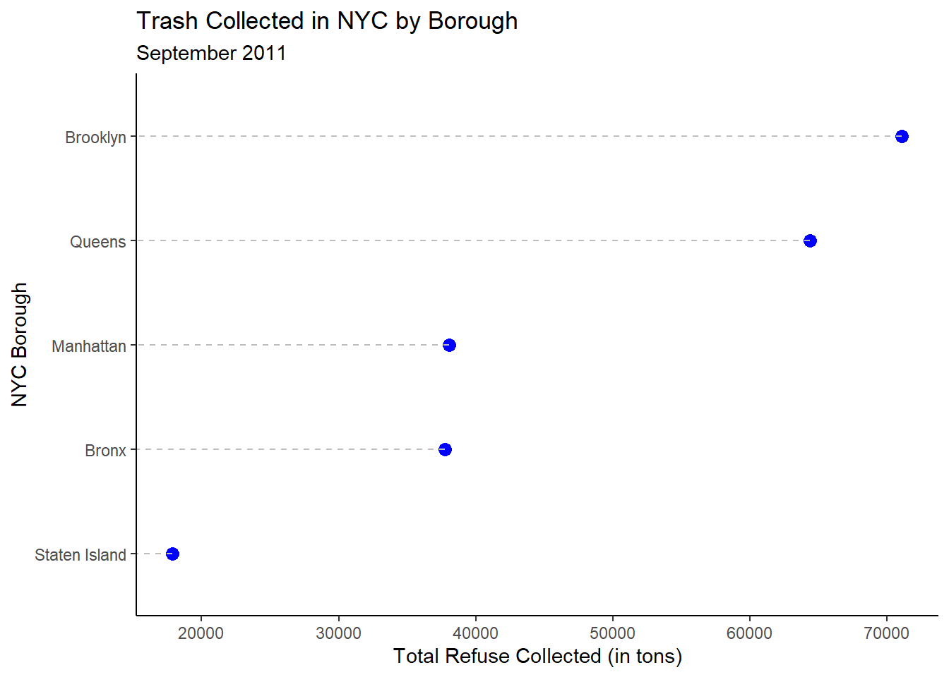
One potential limitation of the dot chart, as it stands, is that even though we only care about the dots themselves, the eye may need help in moving from the y-axis to the dot, especially when the values associated with the dots are large (in a relative sense).
Instead of including a whole bar, what if we included just a dashed line going from the borough name to the dot?
We can do this in multiple ways, but one straightforward way is to add another geom function! This time, we can use the geom_segment function to draw a line segement.
Notice in the geom_segment function, we have to specify when the line segments begin and end in terms of their x and y coordinates. We’ve already specified where x and y start in the global ggplot function: at the value of the point and the borough itself, respectively. Since we are drawing horizontal lines, the value of y doesn’t change. Thus, yend=BOROUGH. Since x starts at the value of the point and since we are again drawing horizontal lines, xend=0. We can also control the color and linetype as well.
trash_tot |>ggplot(aes(x=Sum_Trash,y=reorder(BOROUGH,Sum_Trash))) +geom_point(color='blue',fill='blue',size=3) +geom_segment(aes(yend=BOROUGH),xend=0,color='gray',linetype='dashed') +labs(y="NYC Borough",x="Total Refuse Collected (in tons)",title="Trash Collected in NYC by Borough",subtitle="September 2011") +theme_classic()
3.5 Your Turn!
Now, using the Lahman package and the Batting and People datasets within that package, suppose I want to know who the top 10 homerun hitters during the 2022 Major League Baseball regular season were and how many homeruns they hit?
Create an ordered horizontal barchart to answer this question.
Create an ordered vertical dot chart to answer this question.
How else might this visualization be modified to better communicate the story we are trying to tell?