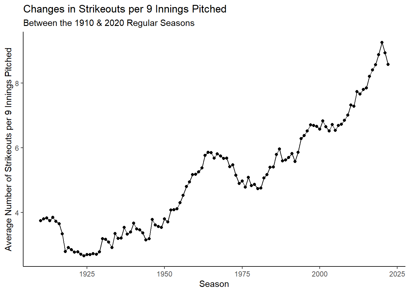
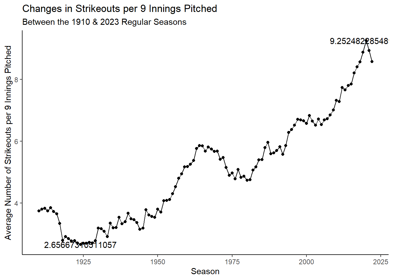
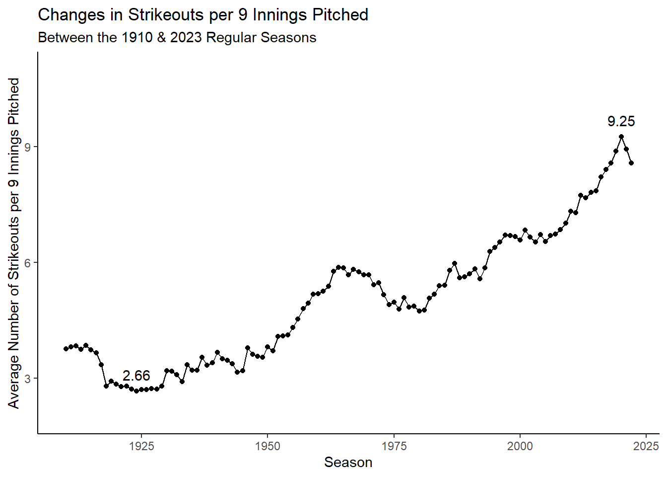
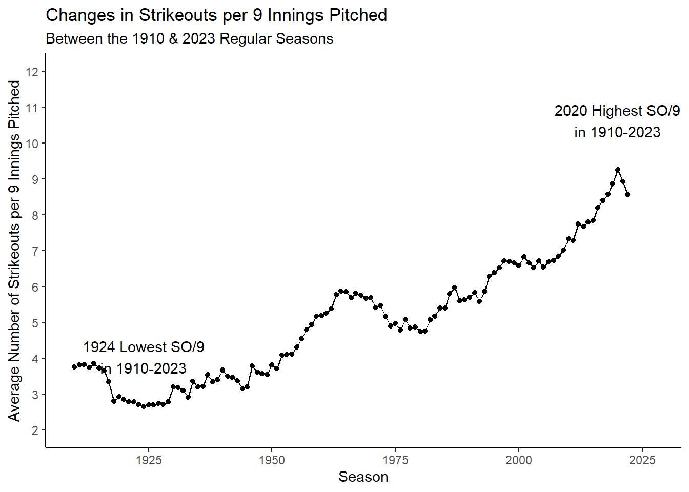
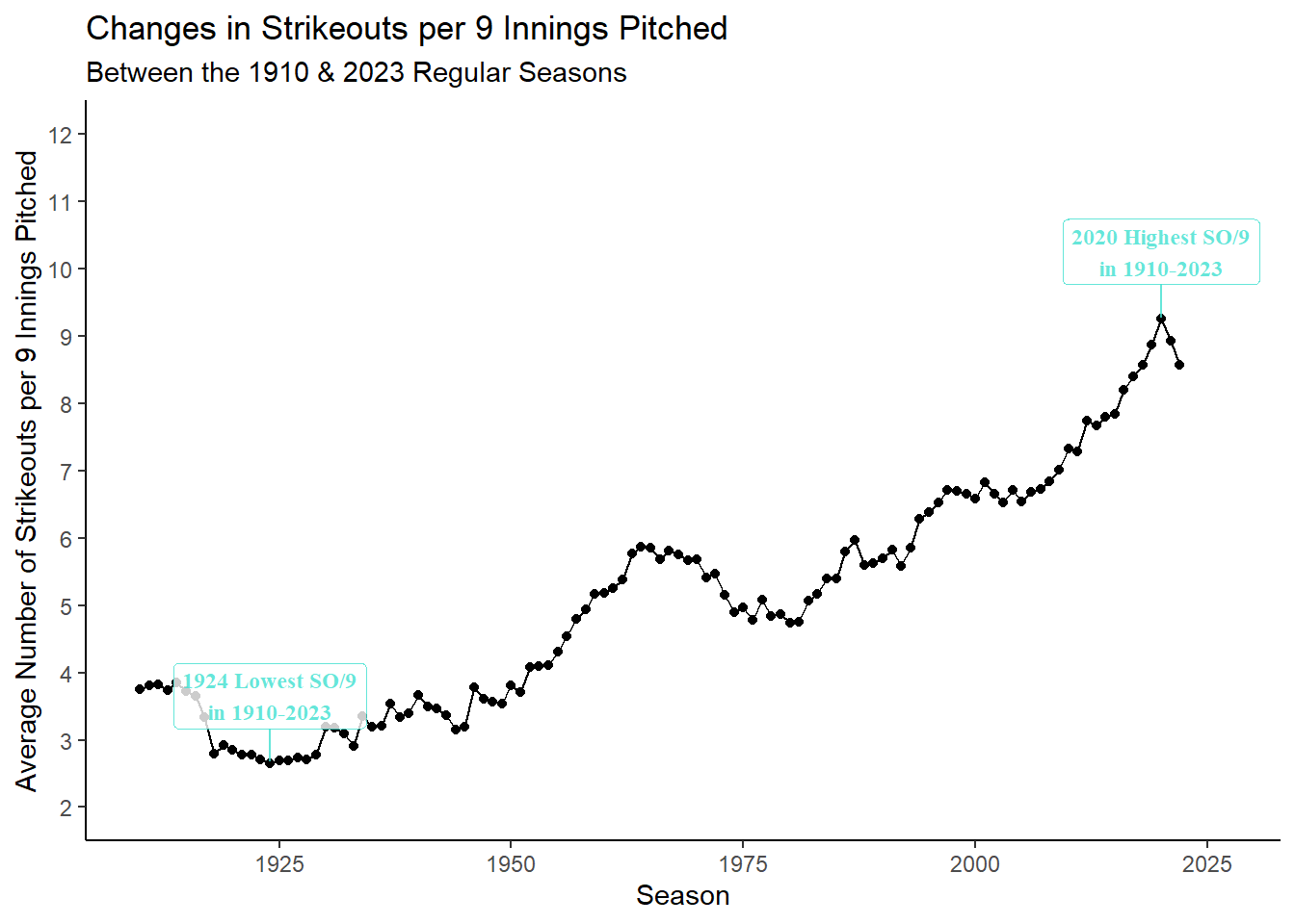
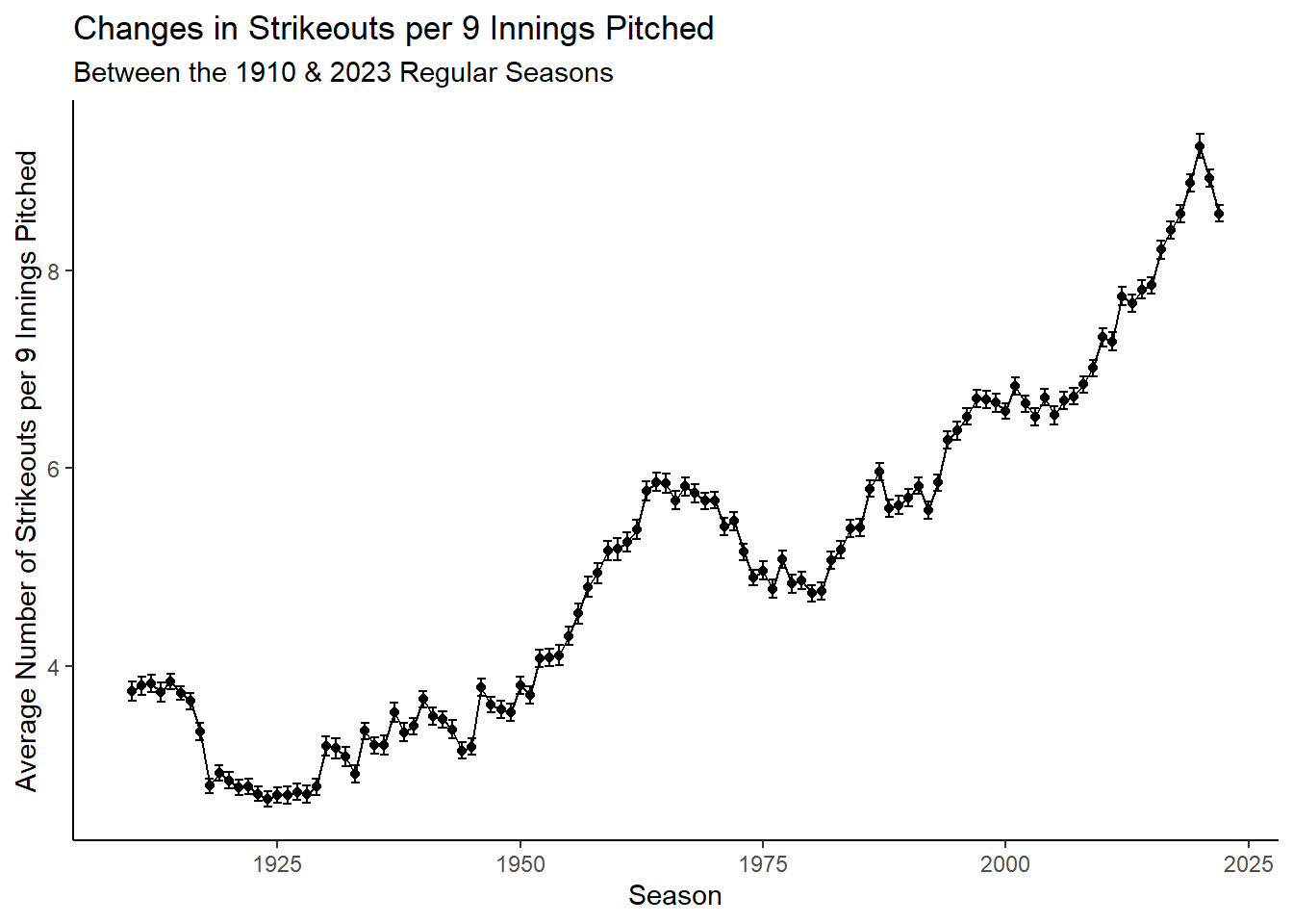
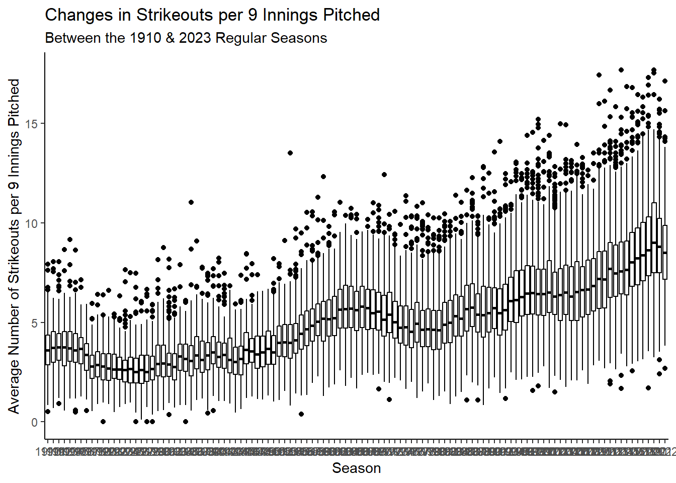
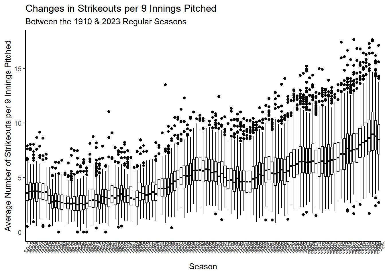
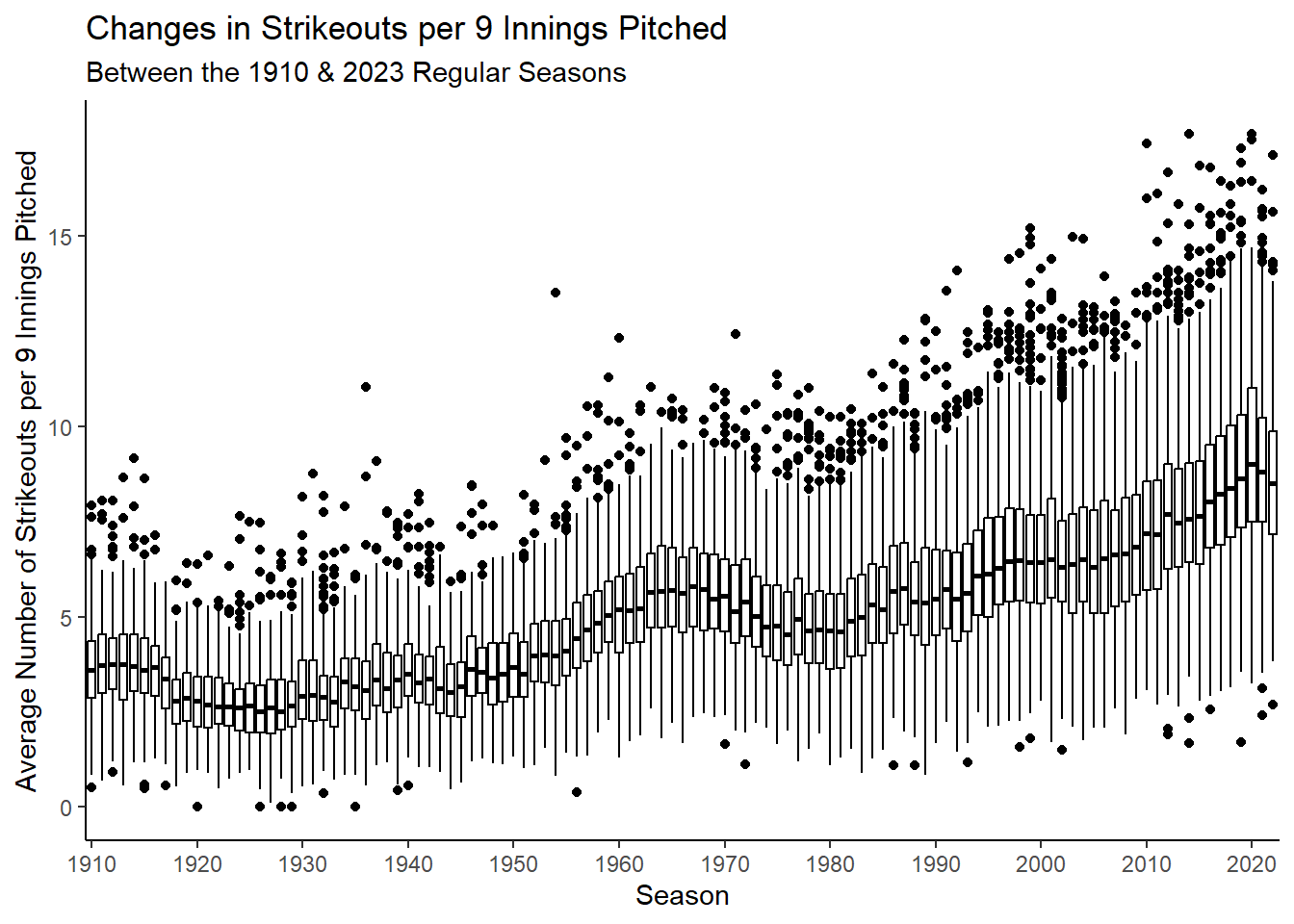
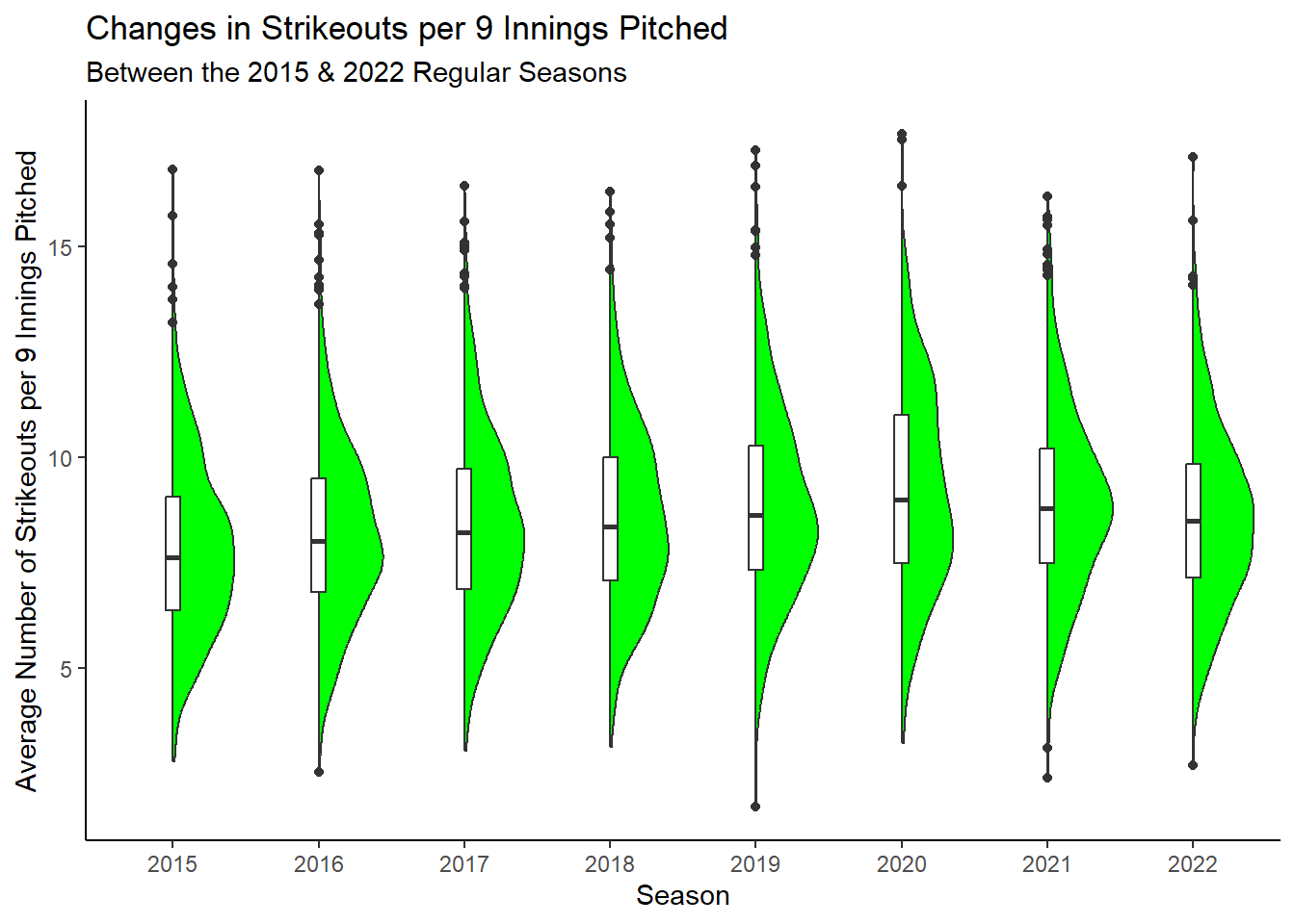
5  Communicating Variation

5.1 Introduction

One of the fundamental concepts in data science and statistics is that of variability.

For instance, not every Major League Baseball team wins the same number of games during a given regular season. The value, total number of wins in this case, varies from team to team.

A goal in data science and statistics is to identify assignable reasons (not necessarily causal reasons) which can help us explain the variability we are observing. We generally call this “modeling.”

However, the conclusions drawn from models may not necessarily be easily disseminated to a broad audience.

This is to say, visualizations may be effective tools we can use to visually communicate variability.

5.2 Major League Baseball Strikeout Example

Suppose I want to see how the average number of strikeouts per nine innings pitched (SO/9) MLB pitchers have thrown has changed, if at all, from the 1910 season to the 2023 season.

Let’s also focus on pitchers who have thrown more than 15 innings to avoid including position players who may occassionally be called on to pitch in lopsided games.

We can make use of the Lahman package to get the data we need and then use the dplyr package to get it into the right format.

library(tidyverse)
so9 <- Lahman::Pitching |>
  filter(between(yearID,1910,2023) & (IPouts/3) >= 15) |>
  mutate(SO9 = SO/(IPouts/3)*9) |>
  group_by(yearID) |>
  summarize(Mean_SO9 = mean(SO9,na.rm=T))

so9 |>
  glimpse()
Rows: 113
Columns: 2
$ yearID   <int> 1910, 1911, 1912, 1913, 1914, 1915, 1916, 1917, 1918, 1919, 1…
$ Mean_SO9 <dbl> 3.750483, 3.805158, 3.828411, 3.742237, 3.847999, 3.729206, 3…

To be clear about what the above code is doing:

  1. We are loading the tidyverse package which includes the dplyr package.
  2. We are taking the Pitching data from the Lahman package and filtering it to include only:
    • Data from the 1910 season to the 2023 season and
    • Data from pitchers who have thrown at least 15 innings.
  3. We are creating a new variable SO9 which is the average number of strikeouts per nine innings pitched using the mutate function.
  4. We are grouping the data by yearID and calculating the mean SO9 for each year.

5.3 Communicating Variation using a Time Series Plot

Okay great! Now that the data are in the right format, we can shift our focus to ggplot2. The specific visualization we will use in this case is one you’ve likely seen before: the time series plot.

This visualization generally consists of a line plot with time on the x-axis (yearID for us) and the variable of interest on the y-axis (Mean_SO9 for us).

To create this type of visualizaiton with ggplot2, we will make use of a new geom: geom_line

so9 |>
  ggplot(aes(x=yearID,y=Mean_SO9)) +
  geom_point() +
  geom_line() +
  labs(x="Season",
       y="Average Number of Strikeouts per 9 Innings Pitched",
       title="Changes in Strikeouts per 9 Innings Pitched",
       subtitle="Between the 1910 & 2020 Regular Seasons") +
  theme_classic()

As we can see, SO/9 has steadily increased over time with notable decreases during the first World War/Flu Pandemic and right around baseball becoming integrated.

The results make sense: pitching has become much more specialized over time and of course, the athletes are also training much differently than in the past.

5.3.0.1 Annotating Time Series Plots

In the above plot, we can see the general trend of SO/9 over time. However, we may want to highlight specific years, such as the years with the highest and lowest SO/9 values.

To achieve this, we will first identify which years had the highest and lowest SO/9 values and save those values to their own dataframe:

minmax <- so9 |>
  filter(Mean_SO9 == min(Mean_SO9) | Mean_SO9 == max(Mean_SO9))

minmax |>
  glimpse()
Rows: 2
Columns: 2
$ yearID   <int> 1924, 2020
$ Mean_SO9 <dbl> 2.656673, 9.252482

Now we can plot by using the geom_text function to add text to the original plot, much like we did in Chapter 4:

so9 |>
  ggplot(aes(x=yearID,y=Mean_SO9)) +
  geom_point() +
  geom_line() +
  geom_text(aes(label=Mean_SO9),data=minmax) +
  labs(x="Season",
       y="Average Number of Strikeouts per 9 Innings Pitched",
       title="Changes in Strikeouts per 9 Innings Pitched",
       subtitle="Between the 1910 & 2023 Regular Seasons") +
  theme_classic()

We observe a couple of problems here:

1. We have too many digits in our labels; we need to round.
2. We need to adjust the position of our labels so they don't overlap with the line plot.

Fortunately, we can fix both problems with relative ease:

so9 |>
  ggplot(aes(x=yearID,y=Mean_SO9)) +
  geom_point() +
  geom_line() +
  geom_text(aes(label=round(Mean_SO9,2)),
            vjust = -1,data=minmax) +
  labs(x="Season",
       y="Average Number of Strikeouts per 9 Innings Pitched",
       title="Changes in Strikeouts per 9 Innings Pitched",
       subtitle="Between the 1910 & 2023 Regular Seasons") +
  theme_classic() +
  scale_y_continuous(limits=c(2,11))

Great! We have nice data labels on our visualization now! But we are now encountering another problem: what in the world do the labels represent?

As of right now, they are numbers on a graph with no context. We need to add some context to these labels to make them more interpretable.

Let’s create a short sentence for each label that explains what the label represents by modifying our minmax dataframe:

minmax <- minmax |>
  mutate(label = case_when(Mean_SO9 == min(Mean_SO9) ~ paste(yearID,"Lowest SO/9\nin 1910-2023"),
                           Mean_SO9 == max(Mean_SO9) ~ paste(yearID,"Highest SO/9\nin 1910-2023"))
  )

minmax |>
  glimpse()
Rows: 2
Columns: 3
$ yearID   <int> 1924, 2020
$ Mean_SO9 <dbl> 2.656673, 9.252482
$ label    <chr> "1924 Lowest SO/9\nin 1910-2023", "2020 Highest SO/9\nin 1910…

Cool! So let’s now add these improved labels to our plot:

so9 |>
  ggplot(aes(x=yearID,y=Mean_SO9)) +
  geom_point() +
  geom_line() +
  geom_text(aes(label=label),
            vjust = -1,data=minmax) +
  labs(x="Season",
       y="Average Number of Strikeouts per 9 Innings Pitched",
       title="Changes in Strikeouts per 9 Innings Pitched",
       subtitle="Between the 1910 & 2023 Regular Seasons") +
  theme_classic()  +
  scale_y_continuous(limits=c(2,12),
                     breaks = seq(1,13)) +
  scale_x_continuous(limits = c(1910,2027))

We can also use a great package called ggrepel to help us avoid overlapping labels. This package is not included in the tidyverse package, so we will need to install it separately:

library(ggrepel)
so9 |>
  ggplot(aes(x=yearID,y=Mean_SO9)) +
  geom_point() +
  geom_line() +
  geom_label_repel(aes(label=label),
                   family='serif',
                   color='turquoise',
                   fontface='bold',
                   size=3,
                   nudge_y = 1,
                   alpha = 0.8,
                   data=minmax) +
  labs(x="Season",
       y="Average Number of Strikeouts per 9 Innings Pitched",
       title="Changes in Strikeouts per 9 Innings Pitched",
       subtitle="Between the 1910 & 2023 Regular Seasons") +
  theme_classic()  +
  scale_y_continuous(limits=c(2,12),
                     breaks = seq(1,13)) +
  scale_x_continuous(limits = c(1910,2027))

Notice in the above geom_label_repel code, I used alpha and nudge_y. The alpha argument controls the transparency of the labels (0 meaning completely invisible and 1 meaning completely opaque), while the nudge_y argument controls the vertical position of the labels (nudge_y=1 means push the label up 1 unit along the y-axis).

Overall, we have added a little more context to our existing plot by using techniques largely familiar to us from previous lessons!

But what is a primary limitation of this plot? It communicates variability across the years but not within the years.

Consequently, we can’t see how the within-year variability has changed over time, which may be useful for us to know! There are a few different options we can employ to help solve this problem:

5.3.1 Time Series Plot with Standard Errors

First, we can plot not only the mean value for each year, but we can also plot the standard errors of the means. This will give us a sense of how much the mean value is varying from year to year.

To do this, we will reaggregate our data now using the rstatix package in order to obtain the standard errors of the means.

library(rstatix)
so9 <- Lahman::Pitching |>
  filter(between(yearID,1910,2023) & (IPouts/3) >= 15) |>
  mutate(SO9 = SO/(IPouts/3)*9) |>
  group_by(yearID) |>
  get_summary_stats(SO9,type='full') |>
  select(yearID,mean,se)

so9 |>
  glimpse()
Rows: 113
Columns: 3
$ yearID <int> 1910, 1911, 1912, 1913, 1914, 1915, 1916, 1917, 1918, 1919, 192…
$ mean   <dbl> 3.750, 3.805, 3.828, 3.742, 3.848, 3.729, 3.648, 3.342, 2.792, …
$ se     <dbl> 0.099, 0.091, 0.091, 0.097, 0.079, 0.071, 0.083, 0.084, 0.076, …

Now that we have the standard errors of the means, we can plot them using geom_errorbar in ggplot2.

so9 |>
  ggplot(aes(x=yearID,y=mean)) +
  geom_point() +
  geom_errorbar(aes(ymin=mean-se,ymax=mean+se)) +
  geom_line() +
  labs(x="Season",
       y="Average Number of Strikeouts per 9 Innings Pitched",
       title="Changes in Strikeouts per 9 Innings Pitched",
       subtitle="Between the 1910 & 2023 Regular Seasons") +
  theme_classic()

5.4 Communicating Variation with Boxplots

Looks pretty good! But what’s the problem?

Primarily, because we have so many seasons (big x-axis) and so many pitchers in a given season (big \(n\) within a given year), the standard errors are very small. This makes it difficult to see the standard errors on the plot.

To get around this issue, it may be preferable to use boxplots rather than standard errors to represent the within-year variation.

However, to visualize boxplots, the data must be in its raw form (i.e., each row represents an individaul pitcher in a given season). To do this, we simply won’t perform any grouping operation:

so9 <- Lahman::Pitching |>
  filter(between(yearID,1910,2023) & (IPouts/3) >= 15) |>
  mutate(SO9 = SO/(IPouts/3)*9)

so9 |>
  glimpse()
Rows: 34,891
Columns: 31
$ playerID <chr> "adamsba01", "albercy01", "amesre01", "anderwi01", "arellfr01…
$ yearID   <int> 1910, 1910, 1910, 1910, 1910, 1910, 1910, 1910, 1910, 1910, 1…
$ stint    <int> 1, 1, 1, 1, 1, 1, 1, 1, 1, 1, 1, 1, 1, 1, 1, 1, 1, 1, 1, 1, 1…
$ teamID   <fct> PIT, SLN, NY1, CIN, BOS, PHA, SLN, SLA, BRO, CIN, BRO, PHA, C…
$ lgID     <fct> NL, NL, NL, NL, AL, AL, NL, AL, NL, NL, NL, AL, NL, AL, AL, N…
$ W        <int> 18, 1, 12, 0, 4, 3, 6, 3, 15, 12, 10, 23, 0, 3, 2, 2, 9, 2, 2…
$ L        <int> 9, 2, 11, 0, 7, 2, 7, 18, 15, 14, 27, 5, 1, 4, 2, 0, 23, 2, 1…
$ G        <int> 34, 4, 33, 7, 18, 15, 26, 34, 35, 35, 44, 30, 12, 13, 6, 19, …
$ GS       <int> 30, 3, 23, 2, 13, 3, 11, 20, 30, 26, 36, 28, 2, 8, 5, 5, 29, …
$ CG       <int> 16, 2, 13, 0, 2, 2, 5, 13, 25, 11, 25, 25, 0, 2, 4, 2, 16, 2,…
$ SHO      <int> 3, 0, 3, 0, 0, 0, 0, 0, 2, 2, 4, 3, 0, 0, 1, 0, 1, 0, 6, 0, 0…
$ SV       <int> 0, 0, 0, 0, 0, 2, 2, 0, 1, 0, 1, 0, 0, 0, 0, 0, 2, 3, 7, 0, 0…
$ IPouts   <int> 735, 83, 571, 52, 300, 171, 348, 577, 815, 643, 930, 750, 114…
$ H        <int> 217, 35, 161, 16, 106, 53, 117, 186, 267, 193, 267, 182, 44, …
$ ER       <int> 61, 19, 47, 9, 32, 17, 39, 71, 87, 73, 91, 44, 20, 22, 14, 19…
$ HR       <int> 4, 1, 3, 0, 1, 0, 4, 2, 2, 3, 4, 1, 1, 0, 0, 2, 4, 0, 3, 1, 0…
$ BB       <int> 60, 20, 63, 17, 24, 23, 53, 97, 107, 94, 82, 47, 23, 32, 12, …
$ SO       <int> 101, 10, 94, 11, 33, 29, 41, 90, 87, 93, 102, 155, 15, 24, 25…
$ BAOpp    <dbl> NA, NA, NA, NA, NA, NA, NA, NA, NA, NA, NA, NA, NA, NA, NA, N…
$ ERA      <dbl> 2.24, 6.18, 2.22, 4.67, 2.88, 2.68, 3.03, 3.32, 2.88, 3.07, 2…
$ IBB      <int> NA, NA, NA, NA, NA, NA, NA, NA, NA, NA, NA, NA, NA, NA, NA, N…
$ WP       <int> 1, 1, 9, 1, 3, 0, 3, 8, 3, 7, 1, 7, 1, 1, 1, 0, 9, 1, 6, 4, 3…
$ HBP      <int> 6, 0, 6, 1, 3, 1, 2, 10, 6, 7, 4, 10, 1, 3, 4, 3, 4, 0, 4, 2,…
$ BK       <int> 0, 0, 0, 0, 0, 0, 0, 0, 0, 0, 0, 0, 1, 0, 0, 0, 0, 0, 0, 0, 0…
$ BFP      <int> 971, 126, 747, 80, 401, 233, 497, 816, 1083, 884, 1194, 936, …
$ GF       <int> 3, 1, 5, 5, 5, 9, 11, 9, 4, 6, 7, 2, 10, 4, 1, 13, 11, 5, 14,…
$ R        <int> 95, 22, 78, 15, 41, 33, 55, 133, 105, 101, 127, 63, 34, 25, 1…
$ SH       <int> NA, NA, NA, NA, NA, NA, NA, NA, NA, NA, NA, NA, NA, NA, NA, N…
$ SF       <int> NA, NA, NA, NA, NA, NA, NA, NA, NA, NA, NA, NA, NA, NA, NA, N…
$ GIDP     <int> NA, NA, NA, NA, NA, NA, NA, NA, NA, NA, NA, NA, NA, NA, NA, N…
$ SO9      <dbl> 3.710204, 3.253012, 4.444834, 5.711538, 2.970000, 4.578947, 3…

Now that the data are in the right format, we can use geom_boxplot to visualize the within-year variation.

so9 |>
  ggplot(aes(x=factor(yearID),y=SO9)) +
  geom_boxplot(fill='white',color='black') +
  labs(x="Season",
       y="Average Number of Strikeouts per 9 Innings Pitched",
       title="Changes in Strikeouts per 9 Innings Pitched",
       subtitle="Between the 1910 & 2023 Regular Seasons") +
  theme_classic()

5.4.1 Formatting Tick Marks in Boxplots

Okay we’re getting closer! Here, we can see that not only is the mean SO/9 increasing over time, but so too is the variability from year to year.

We can see this since the difference between the top of each box and the bottom of each box, the 75th and 25th percentiles, respectively, tends to widen as we move from left to right across the graphic.

But notice what’s going on the x-axis. The tick mark labels are all overlapping to the point where they are completely illegible.

Fortunately, we have a few tricks to modify the tick marks on either the x or y axis. One such trick is to change the angle of the tick mark labels on the x-axis using the element_text function within the versatile theme function:

so9 |>
  ggplot(aes(x=factor(yearID),y=SO9)) +
  geom_boxplot(fill='white',color='black') +
  labs(x="Season",
       y="Average Number of Strikeouts per 9 Innings Pitched",
       title="Changes in Strikeouts per 9 Innings Pitched",
       subtitle="Between the 1910 & 2023 Regular Seasons") +
  theme_classic() +
  theme(axis.text.x = element_text(angle=45))

This may be a useful trick in some situations, but here, since we have so many tick mark labels, it didn’t really help.

What if instead we only included the tick mark labels for every 10 years? We can do this with the scale_x_discrete function much like we did in Chapter 4. Here, we’ll use the breaks argument to specify the tick mark labels we want to include:

so9 |>
  ggplot(aes(x=factor(yearID),y=SO9)) +
  geom_boxplot(fill='white',color='black') +
  labs(x="Season",
       y="Average Number of Strikeouts per 9 Innings Pitched",
       title="Changes in Strikeouts per 9 Innings Pitched",
       subtitle="Between the 1910 & 2023 Regular Seasons") +
  theme_classic() +
  scale_x_discrete(breaks=seq(1910,2023,10))

5.5 Communicating Data with Half-Violin Plots

This looks much better! We can now see the within-year variation in SO/9 over time much more clearly than before.

However, boxplots are not without some limitations of their own. For instance, they do not show the distribution of the data within each year. The boxplot only shows the median, the 25th and 75th percentiles, and the minimum and maximum values.

So what if we wanted the benefits of the boxplots but also wanted to visually assess distributional characteristics of the data within each year, like we do with histograms and density plots?

This is where half-violin plots come in! Half-violin plots are a combination of boxplots and density plots. They show the distribution of the data within each year while also showing the median, the 25th and 75th percentiles, and the minimum and maximum values.

Let’s see how we can create a violin plot using geom_violinhalf using the helper package see, this time focusing only on the years between 2015 and 2022:

library(see)
so9 |>
  filter(between(yearID,2015,2022)) |>
  ggplot(aes(x=factor(yearID),y=SO9)) +
  geom_violinhalf(fill='green') +
  geom_boxplot(width = 0.1, fill = 'white') +
  labs(x="Season",
       y="Average Number of Strikeouts per 9 Innings Pitched",
       title="Changes in Strikeouts per 9 Innings Pitched",
       subtitle="Between the 2015 & 2022 Regular Seasons") +
  theme_classic()

As you can see, we have a nice visualization that shows both the distribution of the data within each year (sideways density plot) and the summary statistics of the data within each year (the overlaid boxplot!).