4 Using Legends, Colors, Fonts, and Axes to Improve Visualizations
4.1 Introduction
In the last section, we learned how to use bar charts and dot charts to help communicate “how much” of something that has been observed between categorical groups.
As we saw, we can make small modifications to our ggplot2 code to substantially improve the interpretability and aesthetic quality of the visualization using things like color and plot themes.
In this section, we’re going to take that a step further by learning how we can leverage ggplot2 code to create and modify legends and elements of our axes, use a variety of colors, color palettes, text and fonts.
Let’s begin by using some text to improve our NYC Garbage visualization:
4.2 Annotating Visualizations with Text
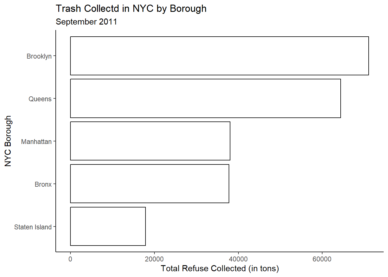
Recall where we left off with our horizontal bar chart:
We can generally see from this visualization that Staten Island produced the least amount of garbage for the month of September 2011 and Brooklyn produced the most.
We can also generally determine the amount of garbage collected. For instance, Staten Island was generally around 20K tons, whereas Queens and Brooklyn were somewhat more than 60K tons.
It might be helpful if we put the actual amount associated with each borough on the bars themselves to increase the amount of information the reader can glean from the visualization.
To do this, we can make use of a new geom: geom_text
trash_tot |>
  ggplot(aes(x=Sum_Trash,y=reorder(BOROUGH,Sum_Trash))) +
  geom_bar(stat='identity',color='black',fill='white') +
  geom_text(aes(label=Sum_Trash)) +
  labs(y = "NYC Borough",
       x = "Total Refuse Collected (in tons)",
       title = "Trash Collected in NYC by Borough",
       subtitle = "September 2011") +
  theme_classic()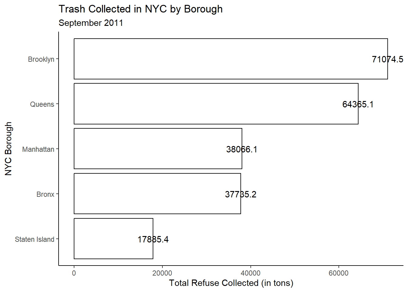
Okay cool! But what is the most obvious problem?
The label is centered at the end of the bar, making the text difficult to read. We can change the justification of the text by using the hjust argument. This argument allows us to horizontally adjust the alignment of our text labels. hjust can assume a value between 0 and 1 with a value of 0 implying complete right justification and a value of 1 implying complete left justification.
Note, hjust and its counterpart vjust can assume values outside of this interval if we want to move our labels further away from the point they are anchored upon.
Let’s try hjust = 1 to move the text labels inside of the bars:
trash_tot |>
  ggplot(aes(x=Sum_Trash,y=reorder(BOROUGH,Sum_Trash))) +
  geom_bar(stat='identity',color='black',fill='white') +
  geom_text(aes(label=Sum_Trash),hjust = 1) +
  labs(y = "NYC Borough",
       x = "Total Refuse Collected (in tons)",
       title = "Trash Collected in NYC by Borough",
       subtitle = "September 2011") +
  theme_classic()
Looks better! But now notice that the label itself is rounded to just one decimal place, which seems unusual. We can fix this, and also move the label more inside of the bar, directly within geom_text
trash_tot |>
  ggplot(aes(x=Sum_Trash,y=reorder(BOROUGH,Sum_Trash))) +
  geom_bar(stat='identity',color='black',fill='white') +
  geom_text(aes(label=round(Sum_Trash)),hjust=1.25) +
  labs(y = "NYC Borough",
       x = "Total Refuse Collected (in tons)",
       title = "Trash Collected in NYC by Borough",
       subtitle = "September 2011") +
  theme_classic()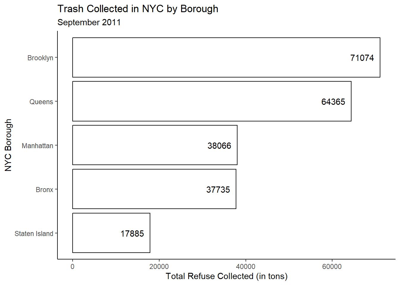
4.2.1 Modifying Font Characteristics
Our visualization is much improved over what we had originally created! But consider the font style. Right now, our visualization uses a sans serif style font in a black color by default.
What if we wanted to change that?
4.2.1.1 Font Family
While we can specify a wide variety of fonts, the main three guaranteed to work everywhere in a ggplot2 visualization are sans (default), serif (like Times New Roman), and mono (like typewriter font):
df <- data.frame(x = 1, y = 3:1, family = c("sans", "serif", "mono"))
df |>
  ggplot(aes(x, y)) +
  geom_text(aes(label = family, family = family))
4.2.1.2 Font Face
We can also make our fonts, bold, italic, bold.italic, or plain:
df <- data.frame(x = 1:4, fontface = c("plain", "bold", "italic", "bold.italic"))
df |>
  ggplot(aes(1, x)) +
  geom_text(aes(label = fontface, fontface = fontface))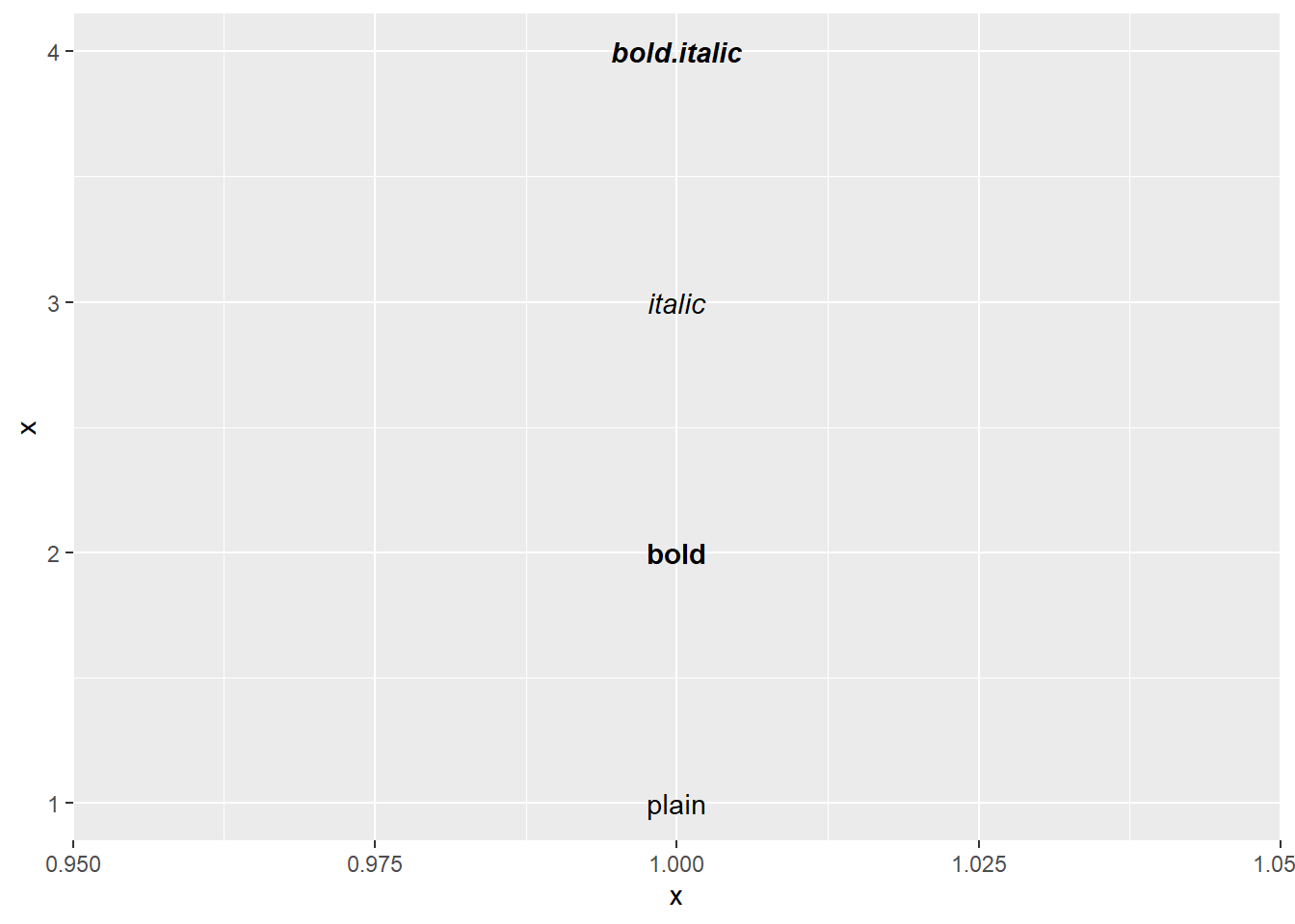
4.2.1.3 Font Color
We can modify the color of our text uniformly by using the color argument within the geom_text function by either using a named color (see the colors() function for the full list) or using hex codes:
## Salmon Font ##
df |>
  ggplot(aes(1, x)) +
  geom_text(aes(label = fontface, fontface = fontface),
            color='salmon')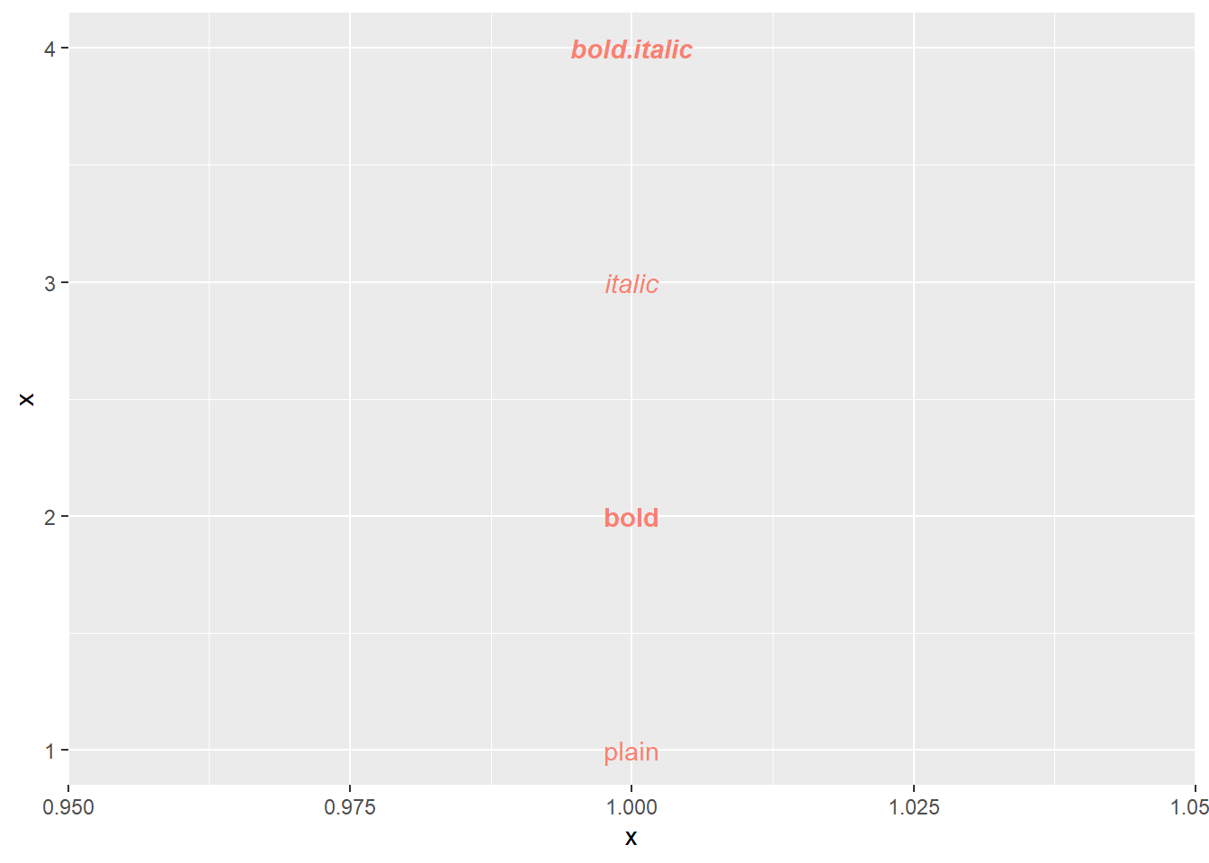
## Manchester City Light Blue ##
df |>
  ggplot(aes(1, x)) +
  geom_text(aes(label = fontface, fontface = fontface),
            color = "#6CABDD")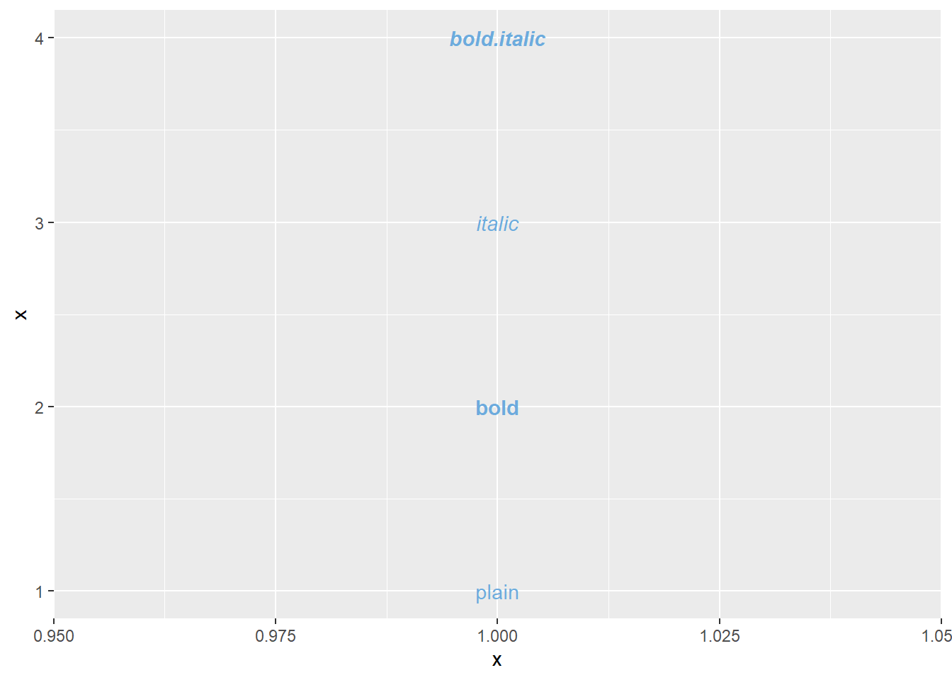
For our NYC Garbage example, suppose I want the text to serif style, with a bold italic font face, and in Atlanta Braves red (hex code #CE1141):
trash_tot |>
  ggplot(aes(x=Sum_Trash,y=reorder(BOROUGH,Sum_Trash))) +
  geom_bar(stat='identity',color='black',fill='white') +
  geom_text(aes(label=round(Sum_Trash)),family='serif',
            fontface='bold.italic',color='#CE1141',hjust=1.25) +
  labs(y = "NYC Borough",
       x = "Total Refuse Collected (in tons)",
       title = "Trash Collected in NYC by Borough",
       subtitle = "September 2011") +
  theme_classic()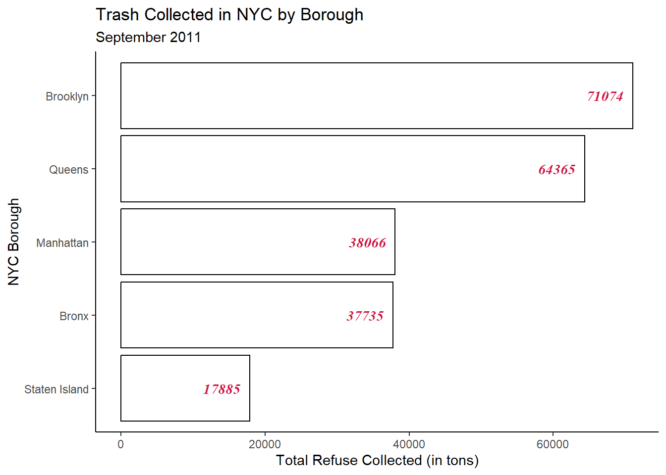
4.3 Modifying Axes Elements
4.3.1 Axis Length
Still using our NYC Garbage example, let’s suppose I’d rather have the text labels outside of the bars to the right rather than inside the bars to the left. Remember, we can make a simple change to our hjust argument to do this:
trash_tot |>
  ggplot(aes(x=Sum_Trash,y=reorder(BOROUGH,Sum_Trash))) +
  geom_bar(stat='identity',color='black',fill='white') +
  geom_text(aes(label=round(Sum_Trash)),family='serif',
            fontface='bold.italic',color='#CE1141',hjust=-0.25) +
  labs(y = "NYC Borough",
       x = "Total Refuse Collected (in tons)",
       title = "Trash Collected in NYC by Borough",
       subtitle = "September 2011") +
  theme_classic()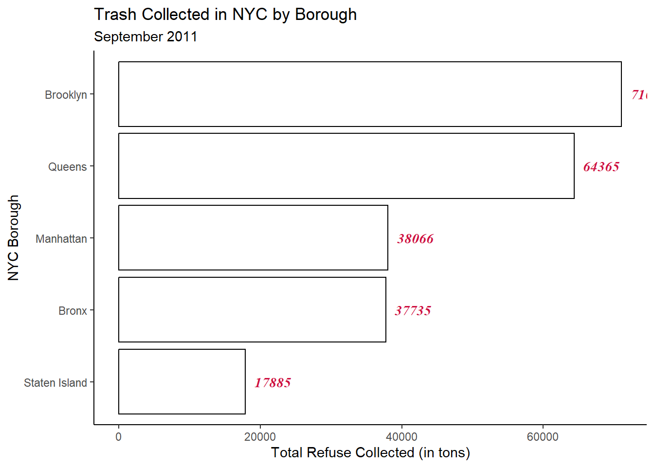
Whoops! Now I can’t see Brooklyn’s label! It’s being truncated by the size of our viewing window.
One way this can be modified is by increasing the x-axis length. We can do this by using the limits argument within the scale_x_continuous function.
trash_tot |>
  ggplot(aes(x=Sum_Trash,y=reorder(BOROUGH,Sum_Trash))) +
  geom_bar(stat='identity',color='black',fill='white') +
  geom_text(aes(label=round(Sum_Trash)),family='serif',
            fontface='bold.italic',color='#CE1141',hjust=-0.25) +
  labs(y = "NYC Borough",
       x = "Total Refuse Collected (in tons)",
       title = "Trash Collected in NYC by Borough",
       subtitle = "September 2011") +
  theme_classic() +
  scale_x_continuous(limits = c(0,75000))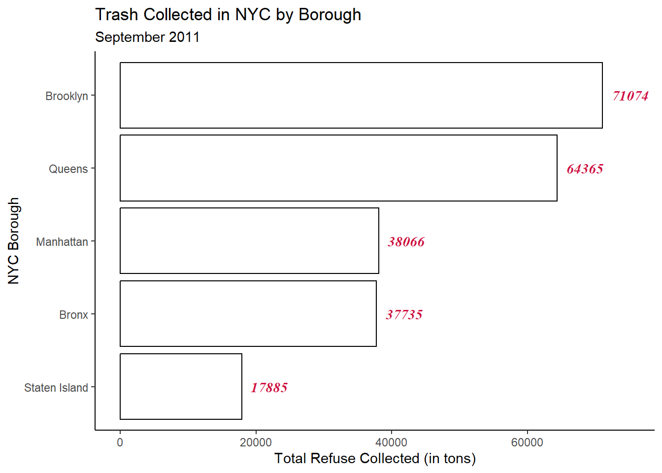
Awesome! That solved the problem!
4.3.2 Modifying Tick Marks
Notice that our tick marks on the x-axis are in increments of 20,000.
What if we want to increase the number of tick marks to be in increments of 10,000 instead? We can again use scale_x_continuous this time making use of the breaks argument:
trash_tot |>
  ggplot(aes(x=Sum_Trash,y=reorder(BOROUGH,Sum_Trash))) +
  geom_bar(stat='identity',color='black',fill='white') +
  geom_text(aes(label=round(Sum_Trash)),family='serif',
            fontface='bold.italic',color='#CE1141',hjust=-0.25) +
  labs(y = "NYC Borough",
       x = "Total Refuse Collected (in tons)",
       title = "Trash Collected in NYC by Borough",
       subtitle = "September 2011") +
  theme_classic() +
  scale_x_continuous(limits = c(0,75000),
                     breaks = seq(0,80000,by=10000))
4.3.3 Formatting Tick Mark Labels
In the above visualization, we note that each tick mark represents a unit measured in the thousands as we can see by the three trailing zeros in each tick mark label.
We may perhaps wish to represent “thousand” by the common label “K” so that 10000 = 10K.
To do this using ggplot2, we can once again use the very useful scale_x_continuous function, now adding a new element of functionality – the labels function:
trash_tot |>
  ggplot(aes(x=Sum_Trash,y=reorder(BOROUGH,Sum_Trash))) +
  geom_bar(stat='identity',color='black',fill='white') +
  geom_text(aes(label=round(Sum_Trash)),family='serif',
            fontface='bold.italic',color='#CE1141',hjust=-0.25) +
  labs(y = "NYC Borough",
       x = "Total Refuse Collected (in tons)",
       title = "Trash Collected in NYC by Borough",
       subtitle = "September 2011") +
  theme_classic() +
  scale_x_continuous(limits = c(0,75000),
                     breaks = seq(0,80000,by=10000),
                     labels = scales::label_number(suffix = "K",
                                                   scale = 1e-3))
Notice in the above code, we are using the label_number function from the scales package to add the “K” suffix to the labels and scale (or multiply) the numeric labels by \(1/1000\).
4.3.4 Modifying Axis Font Styles
We already learned how to modify font styles in the context of geom_text, but we can use the exact same logic and syntax to modify font in our axes as well as titles!
So suppose we want our tick mark labels and axis titles to match the formatting of our data labels. We can do this using the theme function:
trash_tot |>
  ggplot(aes(x=Sum_Trash,y=reorder(BOROUGH,Sum_Trash))) +
  geom_bar(stat='identity',color='black',fill='white') +
  geom_text(aes(label=round(Sum_Trash)),family='serif',
            fontface='bold.italic',color='#CE1141',hjust=-0.25) +
  labs(y = "NYC Borough",
       x = "Total Refuse Collected (in tons)",
       title = "Trash Collected in NYC by Borough",
       subtitle = "September 2011") +
  theme_classic() +
  theme(axis.text.x = element_text(family = 'serif',
                                   face = 'bold.italic',
                                   color = '#CE1141'),
        axis.title.x = element_text(family = 'serif',
                                    face = 'bold.italic',
                                    color = '#CE1141'),
        axis.text.y = element_text(family = 'serif',
                                   face = 'bold.italic',
                                   color = '#CE1141'),
        axis.title.y = element_text(family = 'serif',
                                    face = 'bold.italic',
                                    color = '#CE1141')) +
  scale_x_continuous(limits = c(0,75000),
                     breaks = seq(0,80000,by=10000),
                     labels = scales::label_number(suffix = "K",
                                                   scale = 1e-3))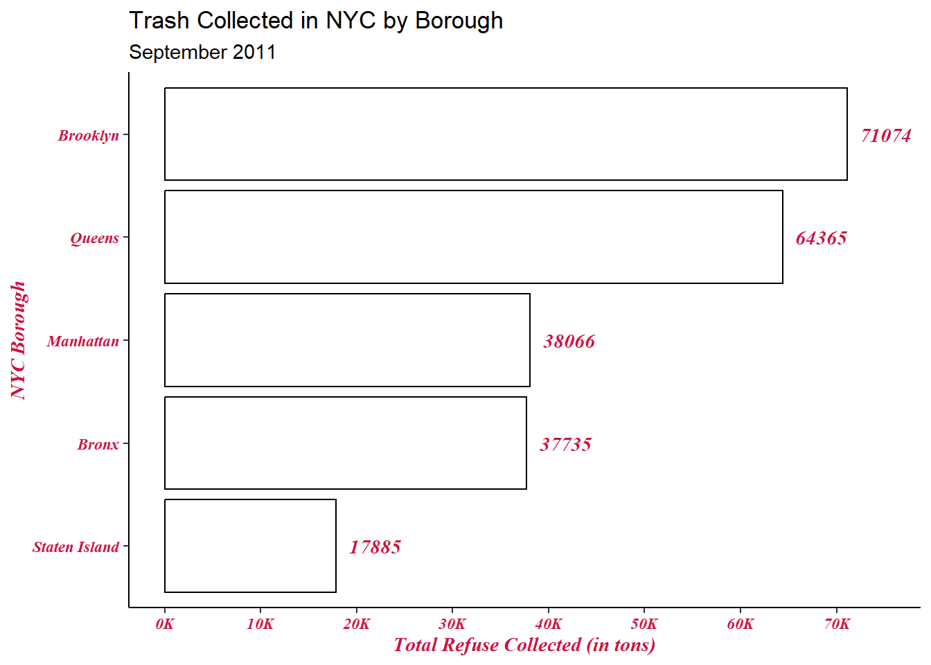
4.4 Legends
Rather than having the bars all be a uniform color (white in this case), suppose I want to have the colors of the bars differ by the particular borough they’re representing. We can do so with a very slight modification to the existing code.
In the global ggplot function, let’s add fill=BOROUGH:
trash_tot |>
  ggplot(aes(x=Sum_Trash,y=reorder(BOROUGH,Sum_Trash),fill=BOROUGH)) +
  geom_bar(stat='identity',color='black') +
  geom_text(aes(label=round(Sum_Trash)),family='serif',
            fontface='bold.italic',color='#CE1141',hjust=-0.25) +
  labs(y = "NYC Borough",
       x = "Total Refuse Collected (in tons)",
       title = "Trash Collected in NYC by Borough",
       subtitle = "September 2011") +
  theme_classic() +
  theme(axis.text.x = element_text(family = 'serif',
                                   face = 'bold.italic'),
        axis.title.x = element_text(family = 'serif',
                                    face = 'bold.italic'),
        axis.text.y = element_text(family = 'serif',
                                   face = 'bold.italic'),
        axis.title.y = element_text(family = 'serif',
                                    face = 'bold.italic')) +
  scale_x_continuous(limits = c(0,80000),
                     breaks = seq(0,80000,by=10000),
                     labels = scales::label_number(suffix = "K",
                                                   scale = 1e-3))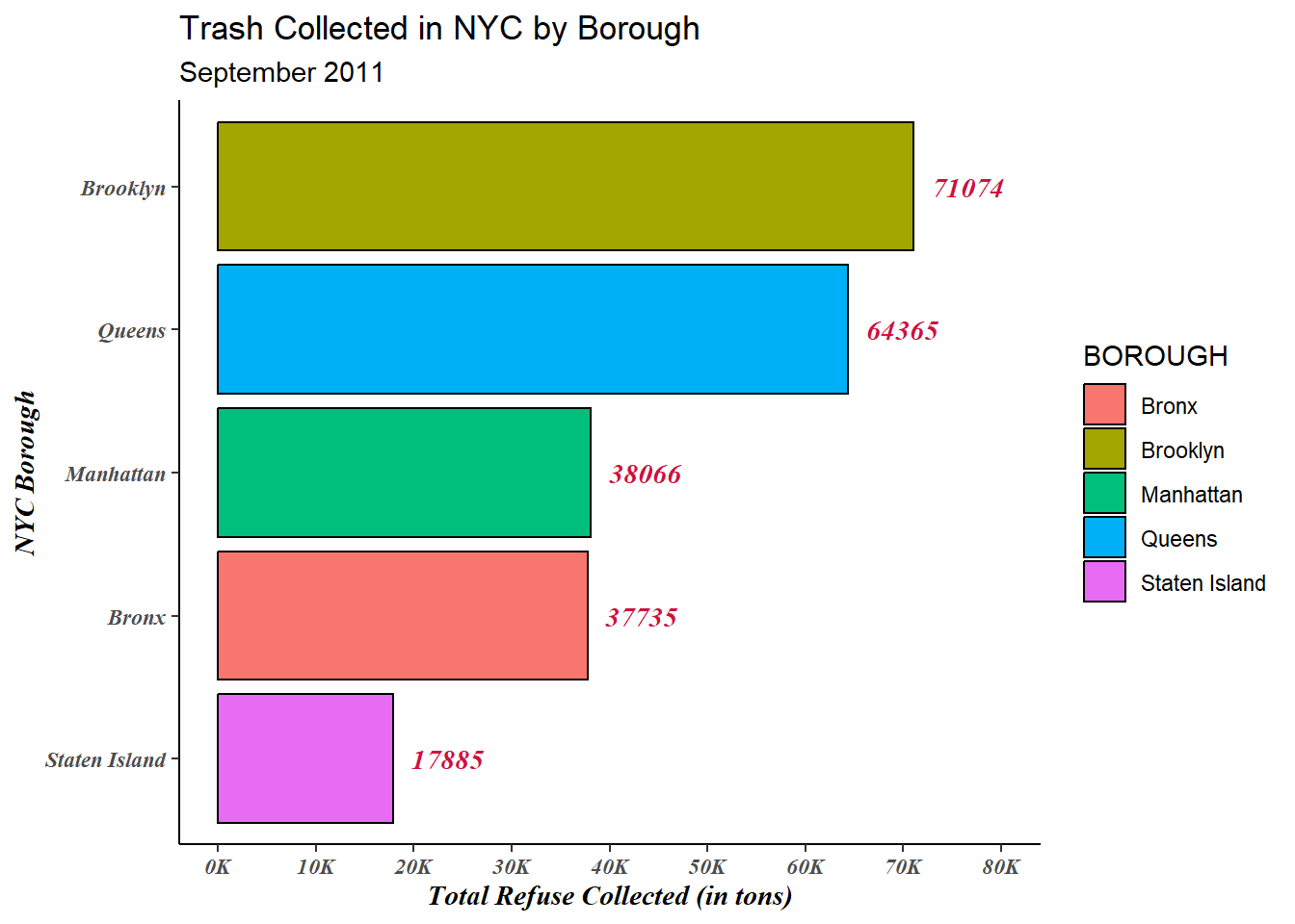
Cool, right? But now, we don’t really have a need for the y-axis labels. We can supress those and the tick marks using the theme function:
trash_tot |>
  ggplot(aes(x=Sum_Trash,y=reorder(BOROUGH,Sum_Trash),fill=BOROUGH)) +
  geom_bar(stat='identity',color='black') +
  geom_text(aes(label=round(Sum_Trash)),family='serif',
            fontface='bold.italic',color='#CE1141',hjust=-0.25) +
  labs(y = "NYC Borough",
       x = "Total Refuse Collected (in tons)",
       title = "Trash Collected in NYC by Borough",
       subtitle = "September 2011") +
  theme_classic() +
  theme(axis.text.x = element_text(family = 'serif',
                                   face = 'bold.italic'),
        axis.title.x = element_text(family = 'serif',
                                    face = 'bold.italic'),
        axis.text.y = element_blank(),
        axis.title.y = element_text(family = 'serif',
                                    face = 'bold.italic'),
        axis.ticks.y = element_blank()) +
  scale_x_continuous(limits = c(0,80000),
                     breaks = seq(0,80000,by=10000),
                     labels = scales::label_number(suffix = "K",
                                                   scale = 1e-3))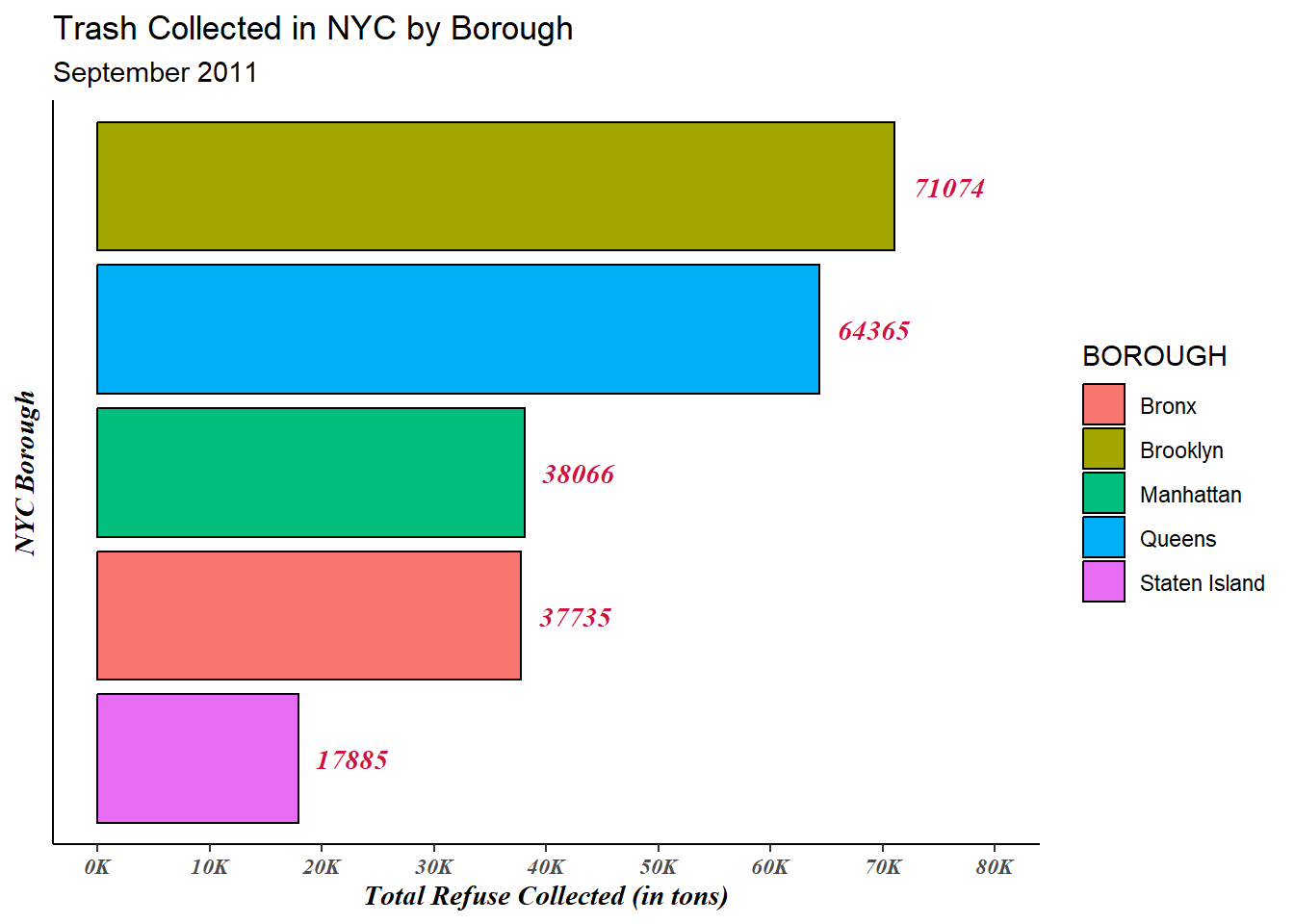
Notice the legend title is all caps. We can modify the legend title in the labs function:
trash_tot |>
  ggplot(aes(x=Sum_Trash,y=reorder(BOROUGH,Sum_Trash),fill=BOROUGH)) +
  geom_bar(stat='identity',color='black') +
  geom_text(aes(label=round(Sum_Trash)),family='serif',
            fontface='bold.italic',color='#CE1141',hjust=-0.25) +
  labs(y = "NYC Borough",
       x = "Total Refuse Collected (in tons)",
       title = "Trash Collected in NYC by Borough",
       subtitle = "September 2011",
       fill = "Borough") +
  theme_classic() +
  theme(axis.text.x = element_text(family = 'serif',
                                   face = 'bold.italic'),
        axis.title.x = element_text(family = 'serif',
                                    face = 'bold.italic'),
        axis.text.y = element_blank(),
        axis.title.y = element_text(family = 'serif',
                                    face = 'bold.italic'),
        axis.ticks.y = element_blank()) +
  scale_x_continuous(limits = c(0,80000),
                     breaks = seq(0,80000,by=10000),
                     labels = scales::label_number(suffix = "K",
                                                   scale = 1e-3))
We can also control the position of the legend within the visualization through the legend.position argument within the theme function (default is legend.position='right'):
## Top ##

trash_tot |>
  ggplot(aes(x=Sum_Trash,y=reorder(BOROUGH,Sum_Trash),fill=BOROUGH)) +
  geom_bar(stat='identity',color='black') +
  geom_text(aes(label=round(Sum_Trash)),family='serif',
            fontface='bold.italic',color='#CE1141',hjust=-0.25) +
  labs(y = "NYC Borough",
       x = "Total Refuse Collected (in tons)",
       title = "Trash Collected in NYC by Borough",
       subtitle = "September 2011",
       fill = "Borough") +
  theme_classic() +
  theme(axis.text.x = element_text(family = 'serif',
                                   face = 'bold.italic'),
        axis.title.x = element_text(family = 'serif',
                                    face = 'bold.italic'),
        axis.text.y = element_blank(),
        axis.title.y = element_text(family = 'serif',
                                    face = 'bold.italic'),
        axis.ticks.y = element_blank(),
        legend.position = "top") +
  scale_x_continuous(limits = c(0,80000),
                     breaks = seq(0,80000,by=10000),
                     labels = scales::label_number(suffix = "K",
                                                   scale = 1e-3))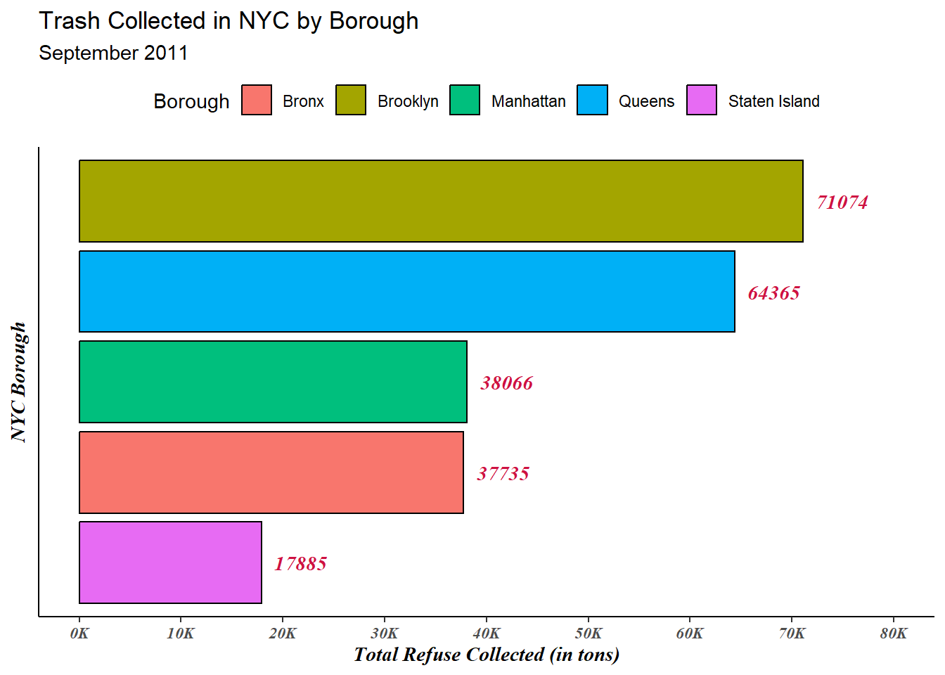
## Bottom ##

trash_tot |>
  ggplot(aes(x=Sum_Trash,y=reorder(BOROUGH,Sum_Trash),fill=BOROUGH)) +
  geom_bar(stat='identity',color='black') +
  geom_text(aes(label=round(Sum_Trash)),family='serif',
            fontface='bold.italic',color='#CE1141',hjust=-0.25) +
  labs(y = "NYC Borough",
       x = "Total Refuse Collected (in tons)",
       title = "Trash Collected in NYC by Borough",
       subtitle = "September 2011",
       fill = "Borough") +
  theme_classic() +
  theme(axis.text.x = element_text(family = 'serif',
                                   face = 'bold.italic'),
        axis.title.x = element_text(family = 'serif',
                                    face = 'bold.italic'),
        axis.text.y = element_blank(),
        axis.title.y = element_text(family = 'serif',
                                    face = 'bold.italic'),
        axis.ticks.y = element_blank(),
        legend.position = "bottom") +
  scale_x_continuous(limits = c(0,80000),
                     breaks = seq(0,80000,by=10000),
                     labels = scales::label_number(suffix = "K",
                                                   scale = 1e-3))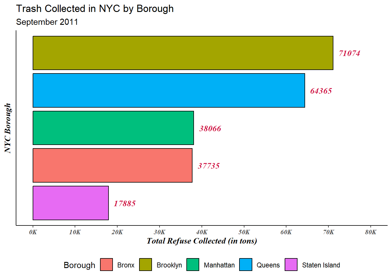
4.4.1 Changing Color Palettes
4.4.1.1 Viridis
In the above plot, the generated colors are the defaults. We can change the palette we use either manually or by using palettes within packages such as viridis, which provides colorblind-friendly palettes.
library(viridis)

trash_tot |>
  ggplot(aes(x=Sum_Trash,y=reorder(BOROUGH,Sum_Trash),fill=BOROUGH)) +
  geom_bar(stat='identity',color='black') +
  geom_text(aes(label=round(Sum_Trash)),family='serif',
            fontface='bold.italic',color='#CE1141',hjust=-0.25) +
  labs(y = "NYC Borough",
       x = "Total Refuse Collected (in tons)",
       title = "Trash Collected in NYC by Borough",
       subtitle = "September 2011",
       fill = "Borough") +
  theme_classic() +
  theme(axis.text.x = element_text(family = 'serif',
                                   face = 'bold.italic'),
        axis.title.x = element_text(family = 'serif',
                                    face = 'bold.italic'),
        axis.text.y = element_blank(),
        axis.title.y = element_text(family = 'serif',
                                    face = 'bold.italic'),
        axis.ticks.y = element_blank(),
        legend.position = "bottom") +
  scale_x_continuous(limits = c(0,80000),
                     breaks = seq(0,80000,by=10000),
                     labels = scales::label_number(suffix = "K",
                                                   scale = 1e-3)) +
  scale_fill_viridis(discrete = T)
Within scale_fill_viridis, we have eight different palettes we can specify (A - H). So for example, if I want to employ the “turbo” option (“H”):
trash_tot |>
  ggplot(aes(x=Sum_Trash,y=reorder(BOROUGH,Sum_Trash),fill=BOROUGH)) +
  geom_bar(stat='identity',color='black') +
  geom_text(aes(label=round(Sum_Trash)),family='serif',
            fontface='bold.italic',color='#CE1141',hjust=-0.25) +
  labs(y = "NYC Borough",
       x = "Total Refuse Collected (in tons)",
       title = "Trash Collected in NYC by Borough",
       subtitle = "September 2011",
       fill = "Borough") +
  theme_classic() +
  theme(axis.text.x = element_text(family = 'serif',
                                   face = 'bold.italic'),
        axis.title.x = element_text(family = 'serif',
                                    face = 'bold.italic'),
        axis.text.y = element_blank(),
        axis.title.y = element_text(family = 'serif',
                                    face = 'bold.italic'),
        axis.ticks.y = element_blank(),
        legend.position = "bottom") +
  scale_x_continuous(limits = c(0,80000),
                     breaks = seq(0,80000,by=10000),
                     labels = scales::label_number(suffix = "K",
                                                   scale = 1e-3)) +
  scale_fill_viridis(discrete = T,
                     option = "H")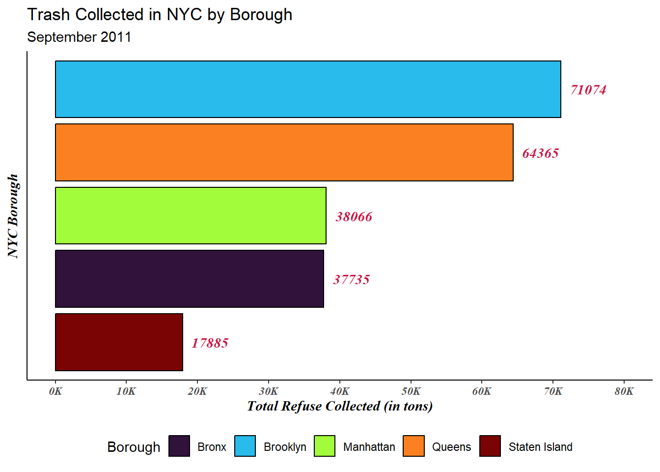
4.4.1.2 RColorBrewer
The RColorBrewer package also provides a nice list of palettes we can use to customize our visualization. Let’s take a look at all of our possibilities:
library(RColorBrewer)
print(brewer.pal.info)
maxcolors category colorblind
BrBG 11 div TRUE
PiYG 11 div TRUE
PRGn 11 div TRUE
PuOr 11 div TRUE
RdBu 11 div TRUE
RdGy 11 div FALSE
RdYlBu 11 div TRUE
RdYlGn 11 div FALSE
Spectral 11 div FALSE
Accent 8 qual FALSE
Dark2 8 qual TRUE
Paired 12 qual TRUE
Pastel1 9 qual FALSE
Pastel2 8 qual FALSE
Set1 9 qual FALSE
Set2 8 qual TRUE
Set3 12 qual FALSE
Blues 9 seq TRUE
BuGn 9 seq TRUE
BuPu 9 seq TRUE
GnBu 9 seq TRUE
Greens 9 seq TRUE
Greys 9 seq TRUE
Oranges 9 seq TRUE
OrRd 9 seq TRUE
PuBu 9 seq TRUE
PuBuGn 9 seq TRUE
PuRd 9 seq TRUE
Purples 9 seq TRUE
RdPu 9 seq TRUE
Reds 9 seq TRUE
YlGn 9 seq TRUE
YlGnBu 9 seq TRUE
YlOrBr 9 seq TRUE
YlOrRd 9 seq TRUEThe first set of palettes (labeled “div”) are best for quantitative data.
The third set (labeled “seq”) are best for quantitative data with clear extremes.
The middle set (labeled “qual”) is what would be most appropriate for us: the qualitative palettes.
Let’s try Pastel1:
trash_tot |>
  ggplot(aes(x=Sum_Trash,y=reorder(BOROUGH,Sum_Trash),fill=BOROUGH)) +
  geom_bar(stat='identity',color='black') +
  geom_text(aes(label=round(Sum_Trash)),family='serif',
            fontface='bold.italic',color='#CE1141',hjust=-0.25) +
  labs(y = "NYC Borough",
       x = "Total Refuse Collected (in tons)",
       title = "Trash Collected in NYC by Borough",
       subtitle = "September 2011",
       fill = "Borough") +
  theme_classic() +
  theme(axis.text.x = element_text(family = 'serif',
                                   face = 'bold.italic'),
        axis.title.x = element_text(family = 'serif',
                                    face = 'bold.italic'),
        axis.text.y = element_blank(),
        axis.title.y = element_text(family = 'serif',
                                    face = 'bold.italic'),
        axis.ticks.y = element_blank(),
        legend.position = "bottom") +
  scale_x_continuous(limits = c(0,80000),
                     breaks = seq(0,80000,by=10000),
                     labels = scales::label_number(suffix = "K",
                                                   scale = 1e-3)) +
  scale_fill_brewer(palette = "Pastel1")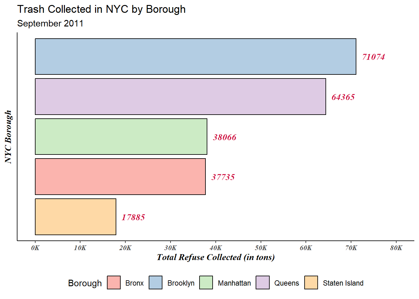
4.4.1.3 Custom Palettes
Being able to use existing color palettes in R packages like viridis and RColorBrewer are nice! But there may be instances where we need to use a custom palette (consider colors for branding!).
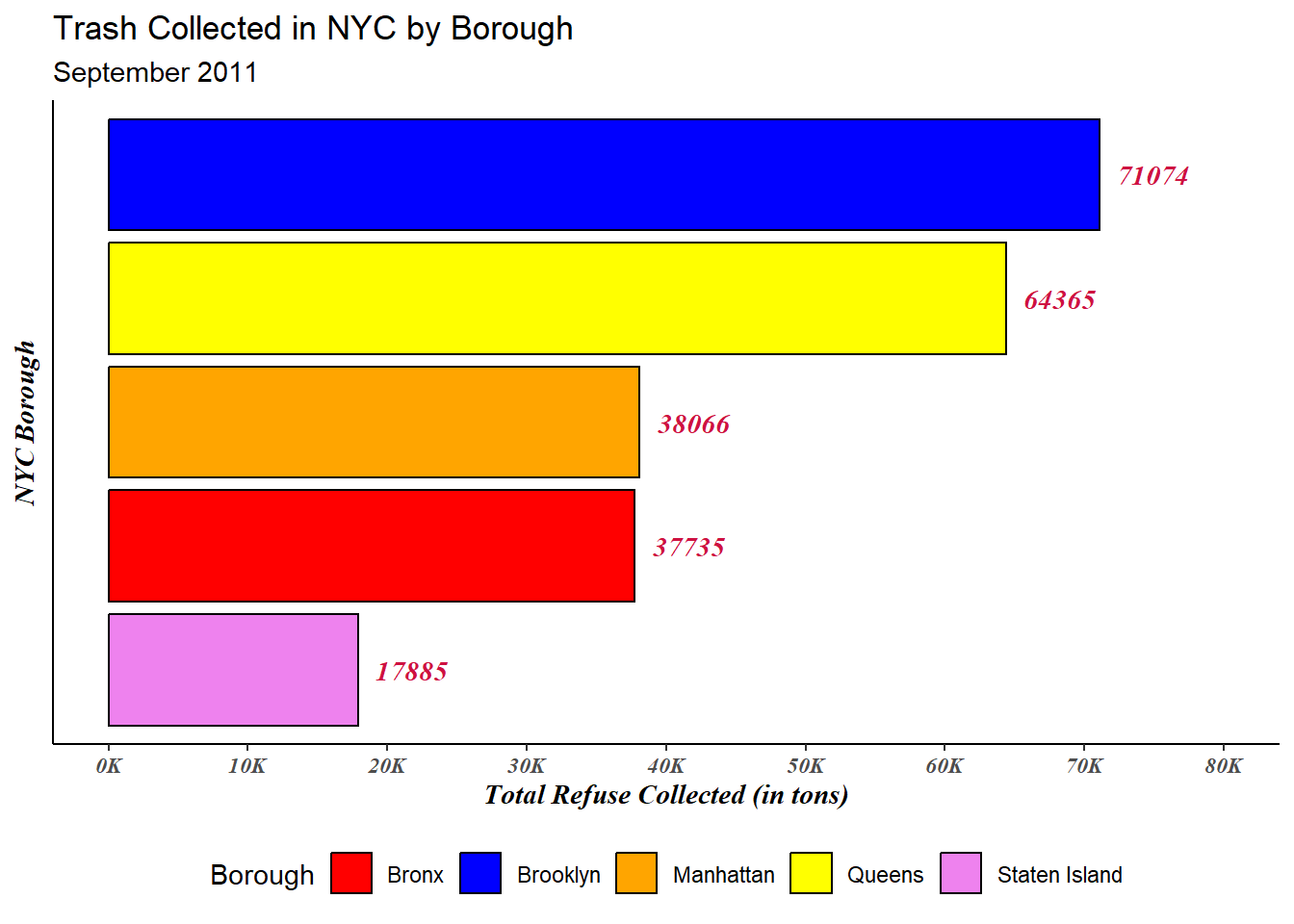
To do this, we will employ the scale_fill_manual function after creating a vector called borough_colors which specifies which borough is assigned which specific color. Note, we can also use hex colors here rather than these specific named colors.
borough_colors <- c("Bronx" = 'red',
                    "Brooklyn" = 'blue',
                    "Manhattan" = "orange",
                    "Queens" = "yellow",
                    "Staten Island" = 'violet')
trash_tot |>
  ggplot(aes(x=Sum_Trash,y=reorder(BOROUGH,Sum_Trash),fill=BOROUGH)) +
  geom_bar(stat='identity',color='black') +
  geom_text(aes(label=round(Sum_Trash)),family='serif',
            fontface='bold.italic',color='#CE1141',hjust=-0.25) +
  labs(y = "NYC Borough",
       x = "Total Refuse Collected (in tons)",
       title = "Trash Collected in NYC by Borough",
       subtitle = "September 2011",
       fill = "Borough") +
  theme_classic() +
  theme(axis.text.x = element_text(family = 'serif',
                                   face = 'bold.italic'),
        axis.title.x = element_text(family = 'serif',
                                    face = 'bold.italic'),
        axis.text.y = element_blank(),
        axis.title.y = element_text(family = 'serif',
                                    face = 'bold.italic'),
        axis.ticks.y = element_blank(),
        legend.position = "bottom") +
  scale_x_continuous(limits = c(0,80000),
                     breaks = seq(0,80000,by=10000),
                     labels = scales::label_number(suffix = "K",
                                                   scale = 1e-3)) +
  scale_fill_manual(values = borough_colors)